Dashboard
The Dashboard provides quick visualizations of your plans and other metrics, and also allows you to download the data you see in the visualizations.
Getting Started
-
Set the merchant you’d like to see results for at upper right:

Hierarchical lets you returns results for multiple merchants (if applicable), while Single Entity lets you return results for just one. Once you have made your selection, click Cancel or OK.
-
Choose the currency you’d like to see results in at upper right:
-
Set the dates you'd like to see data for, and choose your comparison data (used throughout the graphs):
You can choose Today, This week, This month, This year or Set a date range using a calendar. Unless you change the Compare To setting on the right, each of these choices automatically uses comparison data one period back (so Today shows comparison data from yesterday, This Week comparison data from one week ago, This Month comparison data from one month ago, and This Year comparison data from one year ago).
If you’d like change the comparison data to data from one year ago in all cases (except for This year), change the Compare To box at upper right to Previous Year.
-
The dates used are always shown underneath the selection box:

-
Refresh your data periodically at upper right:

Available Sections
Sales Converted (Payment Plans Started)
This shows all plans that have been started within your chosen timeframe.
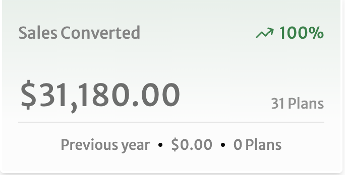
The Sales Converted tile shows the total amount in your currency and the number of plans, as well as comparison statistics with the comparison timeframe you selected: Growth between periods is at upper right and the previous period's statistics are at the bottom.
Amount Visualization
Clicking on the Sales Converted tiles brings up the Amount visualization, showing the comparison timeframe you chose in Getting Started in light green.
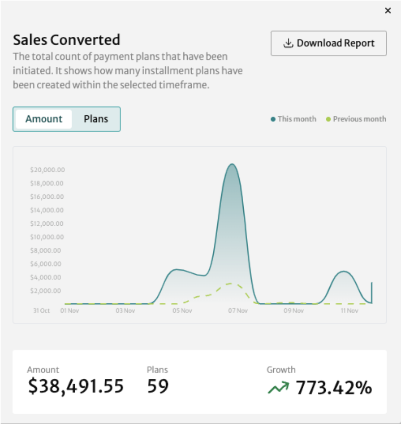
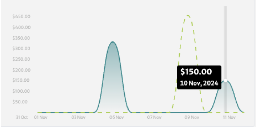
Drag your mouse over the graph to see a popup window with the relevant statistic per day.
Click Download Report to get a CSV file with the data from the visualization:

Plans Visualization
Select the Plans tab to see the visualization by plans instead of amount.
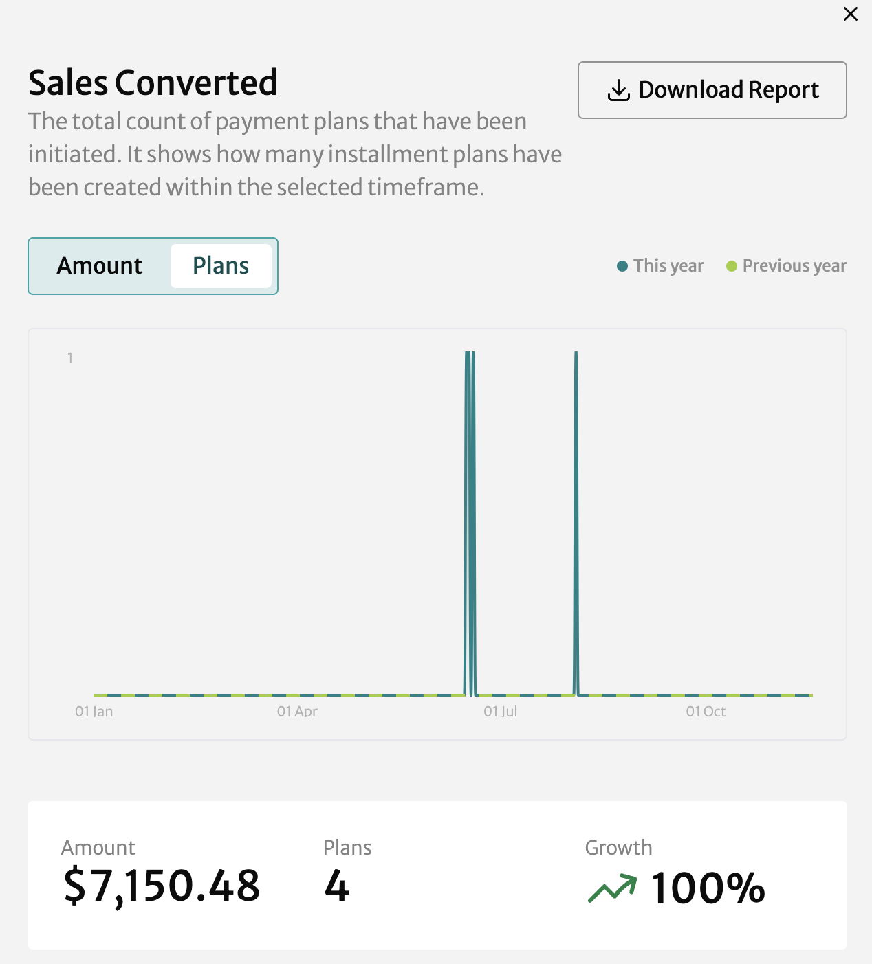
As with the Amount visualization, you can drag your mouse over the graph to see a popup window with the relevant statistic per day or click Download Report to get a CSV file with the data.
Unsuccessful Plans
These are plans that were created but didn't complete successfully (most likely the shopper's card didn't work). The Unsuccessful Plans tile shows the total amount in your currency and the number of plans, as well as comparison statistics with the comparison timeframe you selected: Growth between periods is at upper right and the previous period's statistics are at the bottom.

Amount Visualization
Clicking on the Unsuccessful Plans tile brings up the Amount visualization, showing the comparison timeframe you chose in Getting Started in light green.
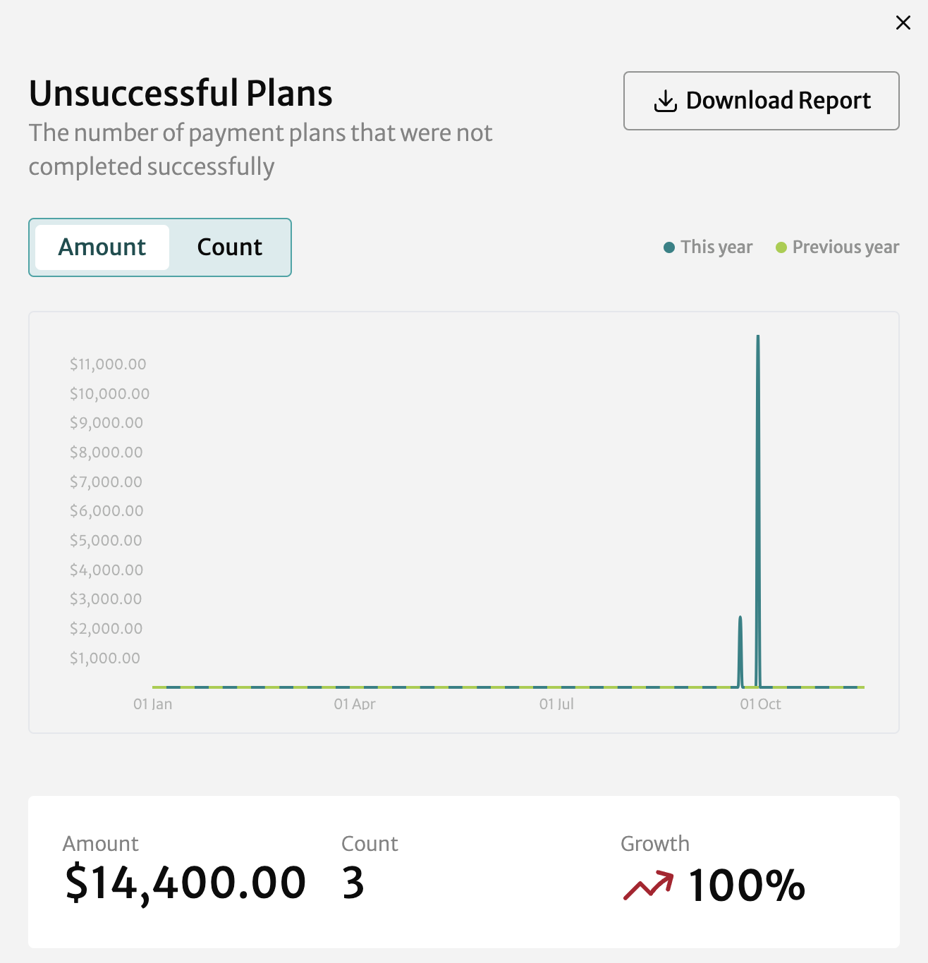
Drag your mouse over the graph to see a popup window with the relevant statistic per day.
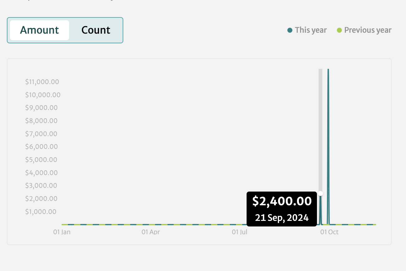
Click Download Report to get a CSV file with the data from the visualization.
Count Visualization
Select the Count tab to see the visualization by plan count instead of amount.
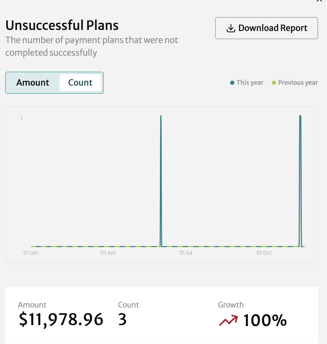
As with the Amount visualization, you can drag your mouse over the graph to see a popup window with the relevant statistic per day or click Download Report to get a CSV file with the data.
Refunds
The Refunds tile shows the total refund amount in your currency and the number of plans, as well as comparison statistics with the comparison timeframe you selected: Growth between periods is at upper right.

Amount Visualization
Click anywhere in the Refunds tile go to the visualization. You can see the comparison timeframe you chose in Getting Started in light green.
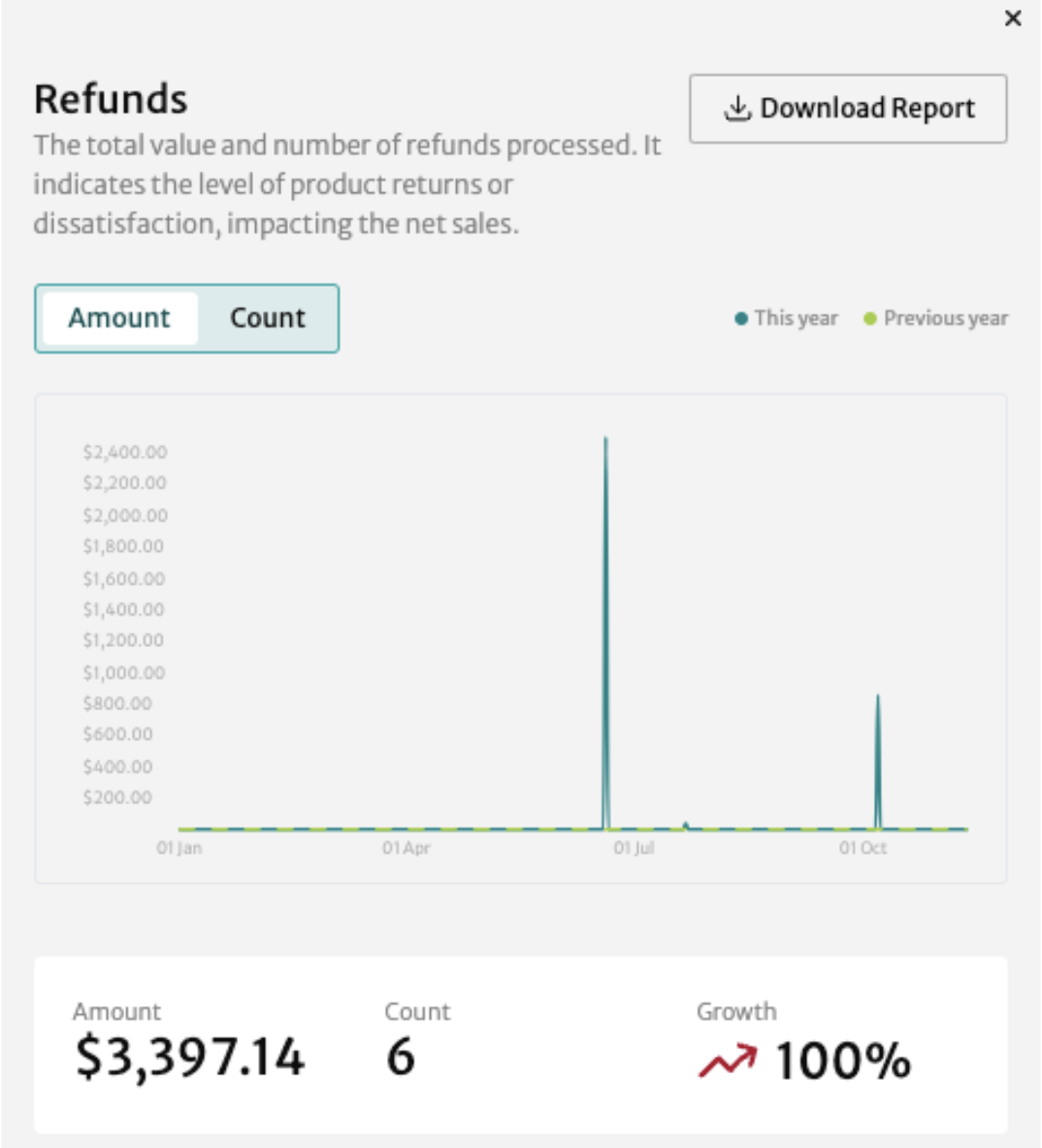
∏ Drag your mouse over the graph to see a popup window with the relevant statistic per day.
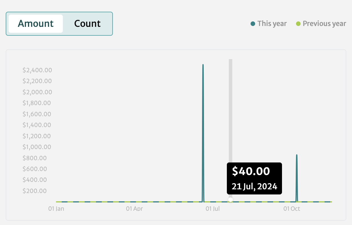
Click Download Report to get a CSV file with the data from the visualization.
Count Visualization
Select the Count tab to see the visualization by plan count instead of amount.
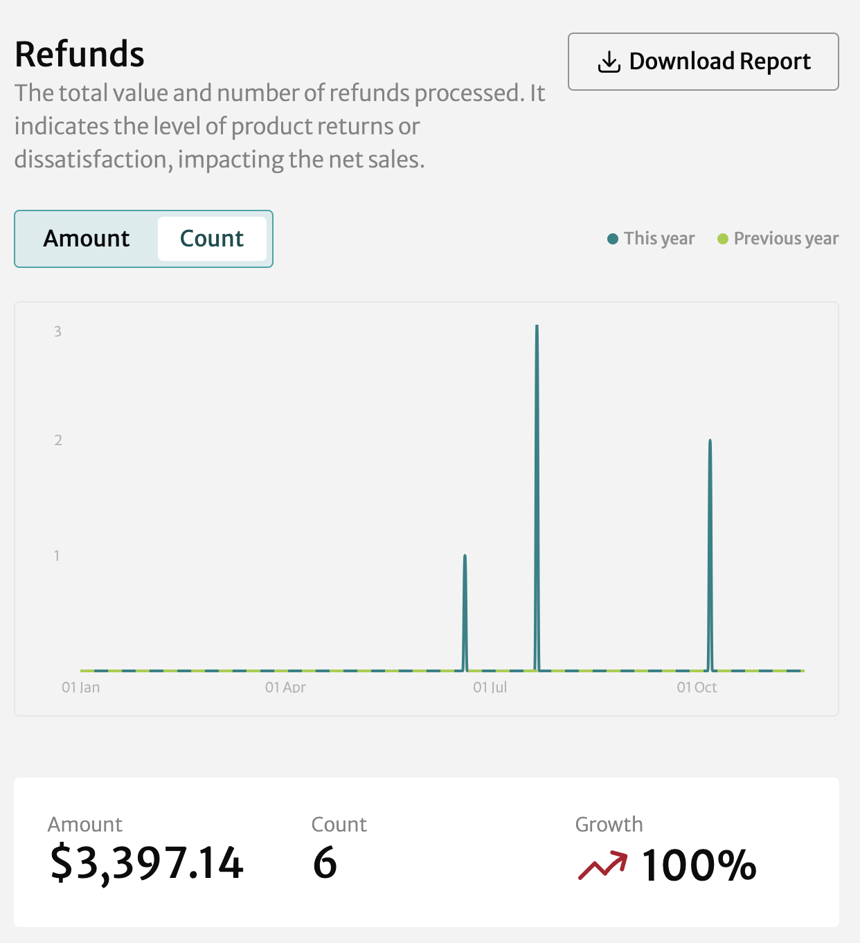
As with the Amount visualization, you can drag your mouse over the graph to see a popup window with the relevant statistic per day or click Download Report to get a CSV file with the data.
Shopper Outstanding Payments
The Shopper Outstanding Payments tiles shows the total amount in your currency owed by all of your shoppers on all of your plans. Growth between periods is at upper right.

It does not have a visualization but you can click Download Report to get a CSV file with data from the primary period.