BigCommerce
Use the instructions below to enable the Splitit installments payment option in the payment and checkout experience on your BigCommerce site, along with messaging that will introduce your customers to installment payment options early in their shopping experience.
Installation
The plugin is installed through the admin panel of your store.
In your BigCommerce admin, select Apps -> Marketplace and click on BIGCOMMERCE.COM/APPS.
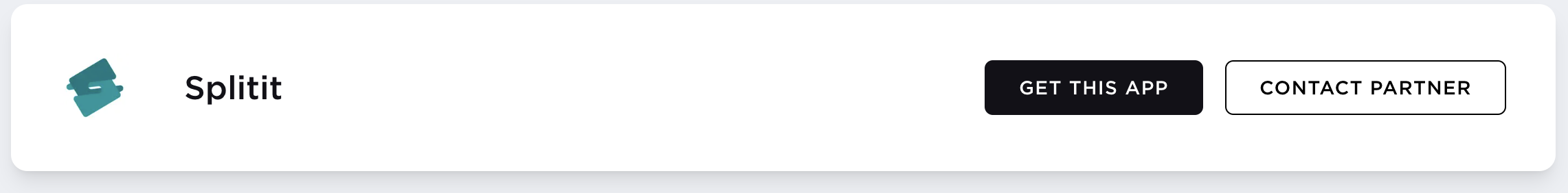
In the BigCommerce App Marketplace, search for "Splitit" in the search bar.
Once the plugin is located, click on it, then select Get This App then Existing BigCommerce store - Login (if applicable).
Then click Install. BigCommerce will download and install the plugin.
Next, at the confirmation page, check the box and then click the button to Confirm.
Configuration
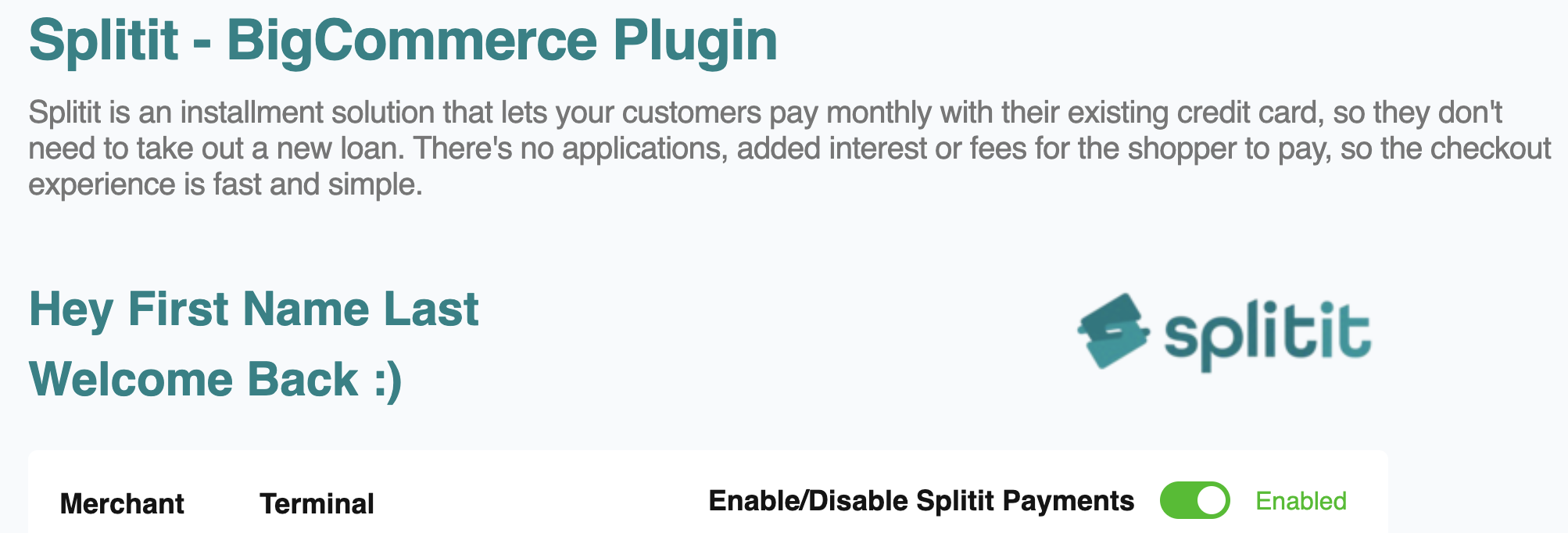
You will need to log into your Splitit account using your BigCommerce Merchant Portal. Go to Apps -> Splitit and choose the account you want to use. A demo account should be used for demo, development, and testing purposes, while a live account should be used to run the store.
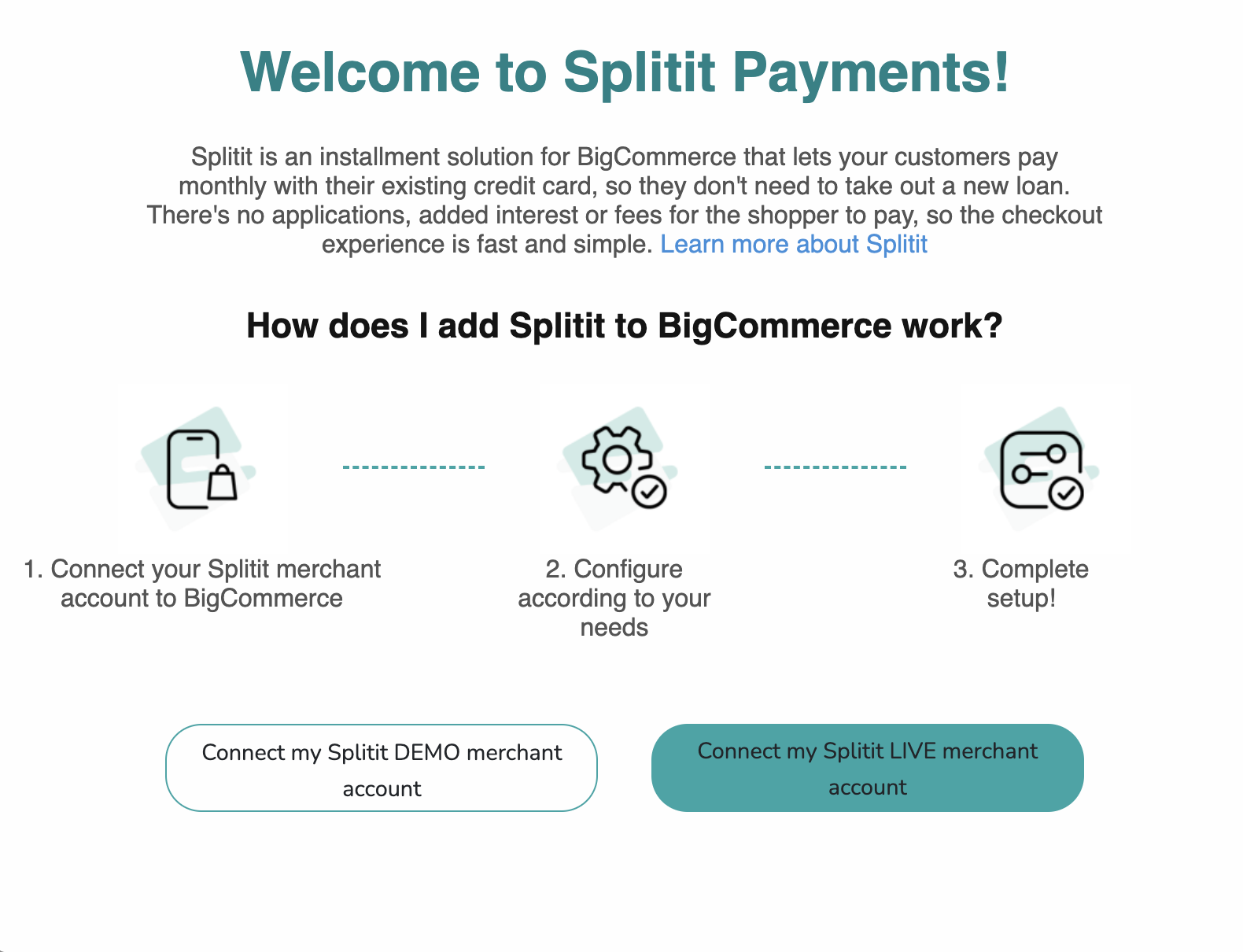
Then, login and choose your merchant and terminal accounts.
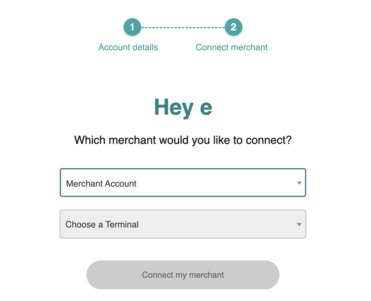
Once the module has been installed successfully, the next step is to configure payments. Go to Apps -> Splitit and select Enable Splitit Payments.
Environment: Splitit offers Sandbox and Production environments. All development work and testing should be done in a sandbox environment.
Once all settings have been entered, scroll down the page and click on Save Changes.
Multi-Storefront Configurations
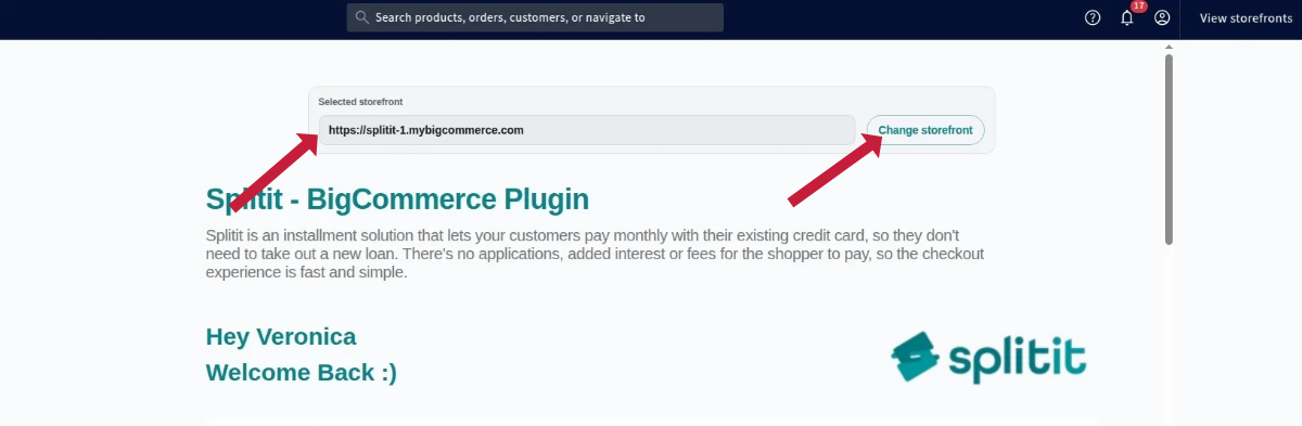
Splitit supports BigCommerce's Multi-Storefront logic. If it is enabled on your website, each time you open the Splitit extension's configuration page, you'll see a request to choose a storefront.
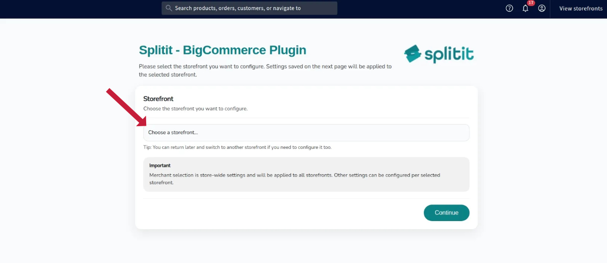
Once a store is chosen, at the top of the page you'll see its URL, as well as a Change storefront button, which allows you to switch to another store.
Things to note:
- Settings are always applied only to the selected store. If the same settings are needed, then each store must be selected one by one and configured with the same setup.
- If your website has only one storefront, there will be no store selector or notification about the currently chosen store. You’ll see the Splitit extension's configuration page right away after selecting the Splitit plugin in the Apps menu.
Payment Method Settings
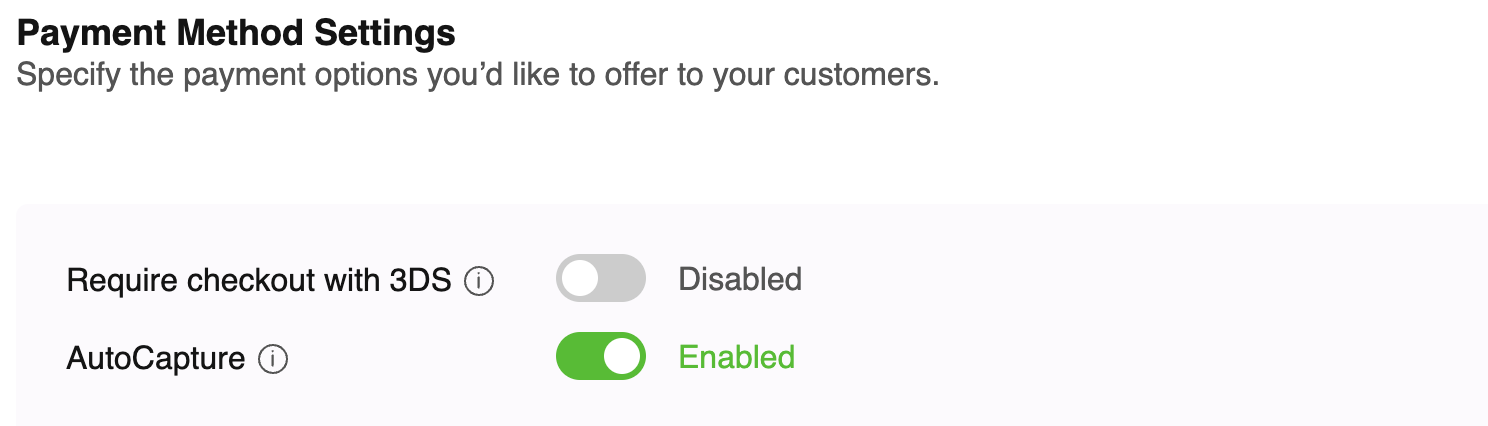
3DS On/Off
3D secure verification can be turned on or off in the configuration.
If “On” is selected, the user must pass through the 3D secure verification shown as a popup. It needs to be successful to place an order.
Splitit AutoCapture
Off – Only authorization is requested when a customer makes a purchase. This ensures that the customer’s account has sufficient funds to complete the transaction.
On – Authorization is requested. Once the payment is authorized, the capture process will begin. This will perform a capture to transfer funds from the customer's credit card to the merchant’s account.
Number of Installments
This configuration sets up desired installment ranges based on order amount. This setting only accepts numbers and nonoverlapping ranges.
For example, the following configuration is valid.
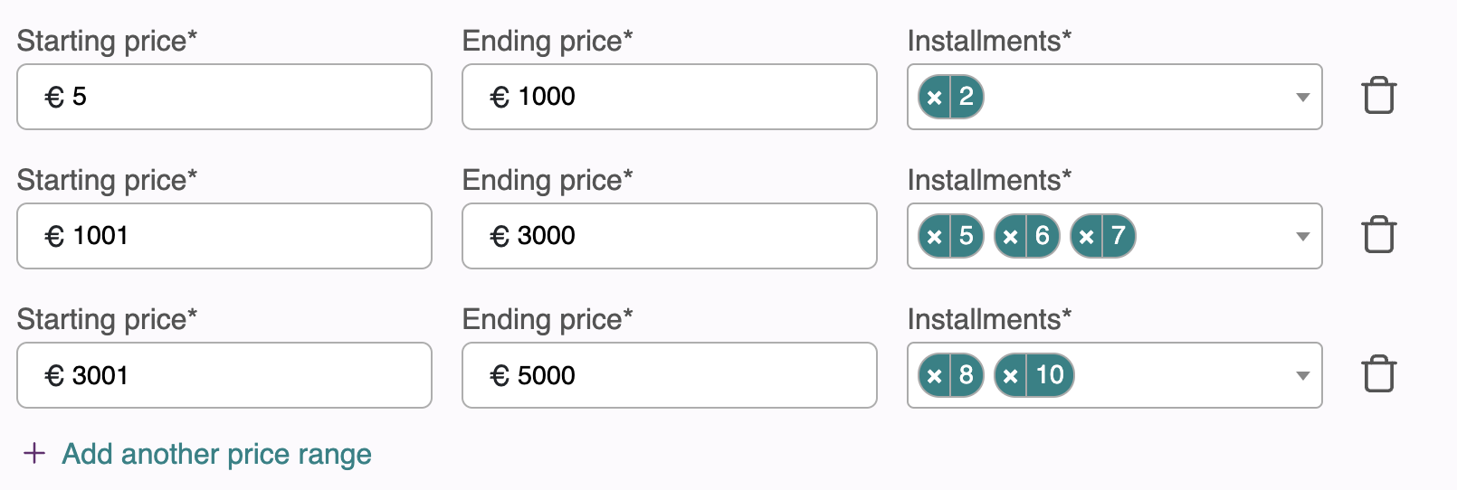
To add an installment configuration, click Add another price range, and enter the Starting price, Ending price, and number of Installments.
Click the trash bin icon to remove the row.
Important: The added range should not overlap. If you add an overlapping range, the system will show an error.
| Wrong configuration: | |
|---|---|
| 100-500 | 2,3,4 |
| 300-700 | 4,7,8 |
| Correct configuration: | |
|---|---|
| 100-500 | 2,3,4 |
| 501-700 | 5,6,7 |
On-Site Messaging Settings
The On-Site Messaging settings manage the advertisement of installment plans throughout your site. It is possible to configure them separately for your Home Page, Catalog Page, Product Page, Cart Page, and Checkout Page.
The available Messaging elements are Strips, Banners, Logos and One Liners.
Strip
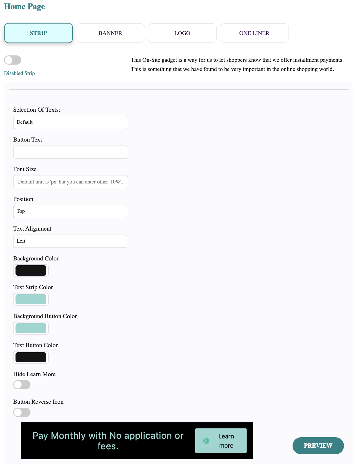
Enabled Strip/Disabled Strip - This switch allows you to turn on or off the message type for the current page type. Only one message type can be enabled for the current page type.
Selection of Texts: Default - The strip uses the default message. Other - Allows you to enter your own message.
Font Size. You can enter the font size. The default value is in pixels, but you can specify other measurements, like percentages.
Position - The strip can be positioned at the page's top or bottom.
Text Alignment - The text can be centered or located at the left or right edge of the strip.
Background Color - The color of the stripe. It can be selected by color picking or by entering RGB, HSL, or HEX values. To switch from RGB to any other mode, click on the letters "RGB".
Background Button Color - The color of the button that contains the Learn More link. It can be selected by color picking or by entering RGB, HSL, or HEX values. To switch from RGB to any other mode, click on the letters "RGB".
Text Button Color - The Learn More link text color. It can be selected by color picking or by entering RGB, HSL, or HEX values. To switch from RGB to any other mode, click on the letters "RGB".
Hide Learn More - This switch enables or disables the Learn More button.
Button Reverse Icon - This switch changes the order of the Splitit logo and the text Learn More on the link.
The PREVIEW button applies the changes to the message example that can be seen on this page.
Banner
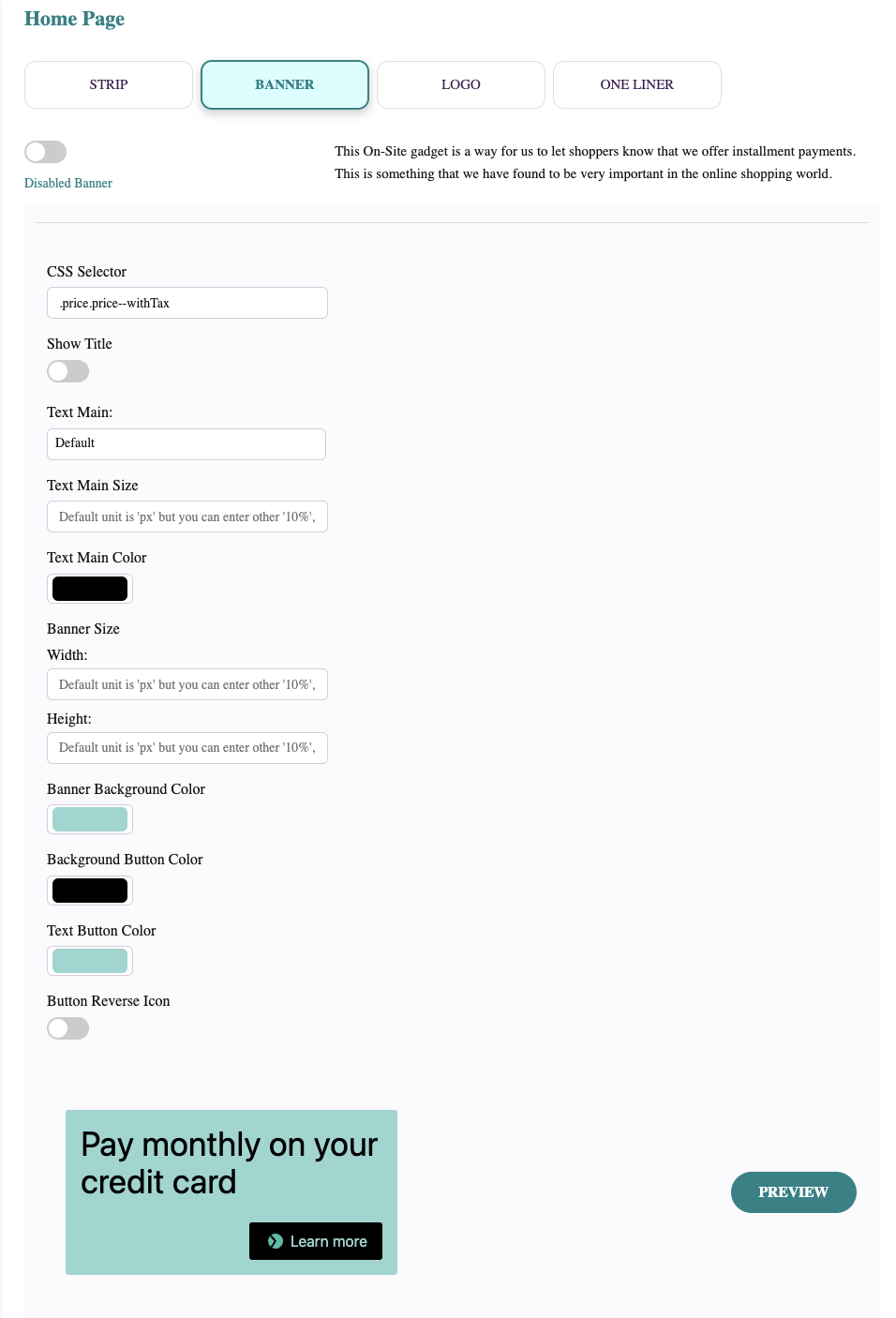
Enabled Banner/Disabled Banner - This switch allows you to turn on or off the message type for the current page type. Only one message type can be enabled for the current page type.
CSS Selector - This option is needed to help the plugin identify the element where the banner should be attached. Examples: ".yourClassName" or "#yourId"
Text Main: Default - The banner will use the default message. Other - Allows you to enter your own message.
Text Main Size. You can enter the font size. Default value is in pixels, but you can specify other measurements, like percentage.
Text Main Color - The color of the text on the banner. It can be selected by color picking or by entering RGB, HSL, or HEX values. To switch from RGB to any other mode, click on the letters "RGB".
Banner Size, Width and Height - You can enter the overall banner size. Default value is in pixels, but you can specify other measurements, like percentage.
Banner Background Color - The color of the stripe. It can be selected by color picking or by entering RGB, HSL, or HEX values. To switch from RGB to any other mode, click on the letters "RGB".
Background Button Color - The color of the button that contains the Learn More link. It can be selected by color picking or by entering RGB, HSL, or HEX values. To switch from RGB to any other mode, click on the letters "RGB".
Text Button Color - The Learn More link text color. It can be selected by color picking or by entering RGB, HSL, or HEX values. To switch from RGB to any other mode, click on the letters "RGB".
Button Reverse Icon - This switch changes the order of the Splitit logo and the Learn More text on the link.
The Preview button applies the changes to the message example that can be seen on the page.
Logo
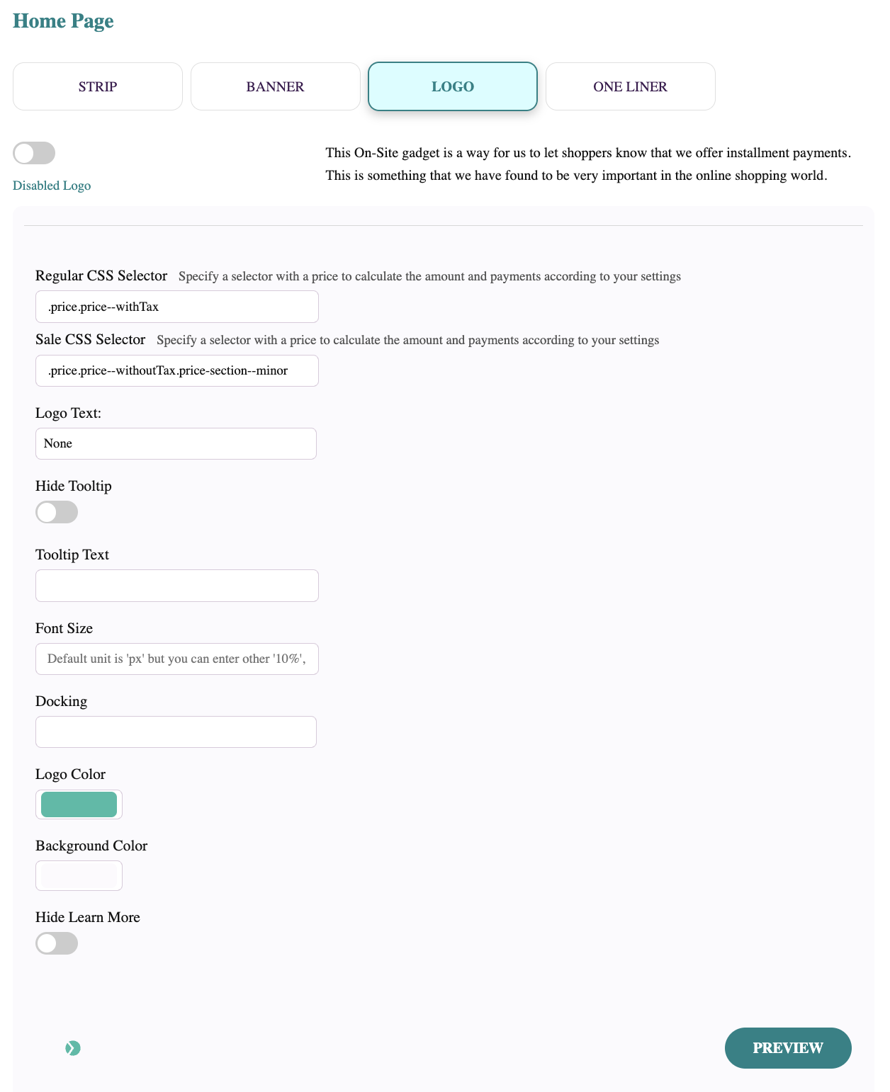
Enabled Logo/Disabled Logo - This switch allows you to turn on or off the message type for the current page type. Only one message type can be enabled for the current page type.
Regular CSS Selector - This option is needed to help the plugin identify the element where the regular Logo should be attached. Examples: ".yourClassName" or "#yourId"
Sale CSS Selector - This option is needed to help the plugin identify the element where the sale Logo should be attached. Examples: ".yourClassName" or "#yourId"
Logo Text: None - The text near the logo is absent. Other - Allows you to enter your own message.
Hide Tooltip - This switch disables the tooltip, which by default shows up when a customer moves the mouse over the logo.
Tooltip Text - An option that allows setting custom text for the tooltip, which by default shows up when a customer moves the mouse over the logo.
Font Size. You can enter the font size. Default value is in pixels, but you can specify other measurements, like percentages.
Docking - The relative position of the logo.
Logo Color - The color of the logo. It can be selected by color picking or by entering RGB, HSL, or HEX values. To switch from RGB to any other mode, click on the letters "RGB".
Background Color - The color of the small square area around the logo. It can be selected by color picking or by entering RGB, HSL, or HEX values. To switch from RGB to any other mode, click on the letters "RGB".
Hide Learn More - This switch enables or disables the Learn More link in the tooltip.
The PREVIEW button applies the changes to the message example that can be seen on this page.
One Liner
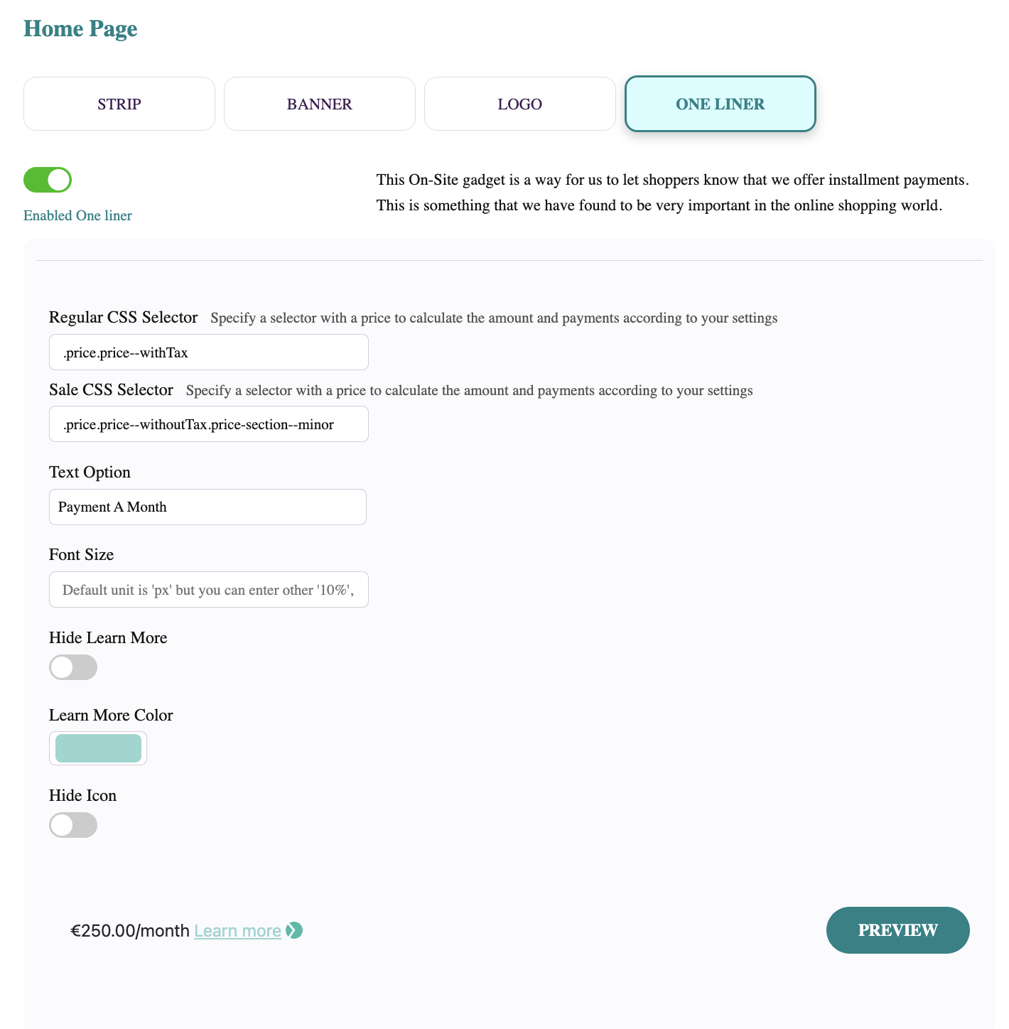
Enabled One liner/Disabled One Liner - This switch allows you to turn on or off the message type for the current page type. Only one message type can be enabled for the current page type.
Regular CSS Selector - This option is needed to help the plugin identify where the One Liner should be for regular products. You need to enter the selector for the element that will contain the product price. Examples: ".yourClassName" or "#yourId"
Sale CSS Selector - This option is needed to help the plugin identify where the One Liner should be for the products identified as sale products. You need to enter the selector for the element that will contain the product price. Examples: ".yourClassName" or "#yourId"
Text option - A parameter that allows configuring text for the One Liner. Four built-in options are available, but you can also configure your own text.
Font Size. You can specify the font size. Default value is in pixels, but you can use other measurements, like percentages.
Hide Learn More - The switch enables or disables the Learn More link. The Splitit logo stays visible.
Learn More Color - The color of the Learn More link. It can be selected by color picking or by entering RGB, HSL, or HEX values. To switch from RGB to any other mode, click on the letters "RGB".
Hide Icon - This switch hides the Splitit logo. The Learn More link stays visible.
The PREVIEW button applies the changes to the message example that can be seen on this page.
On-Site Messaging CSS
This block allows CSS customization of the Splitit blocks on the storefront.
Flex Fields CSS
This block allows CSS customization of the Splitit block on the checkout page.
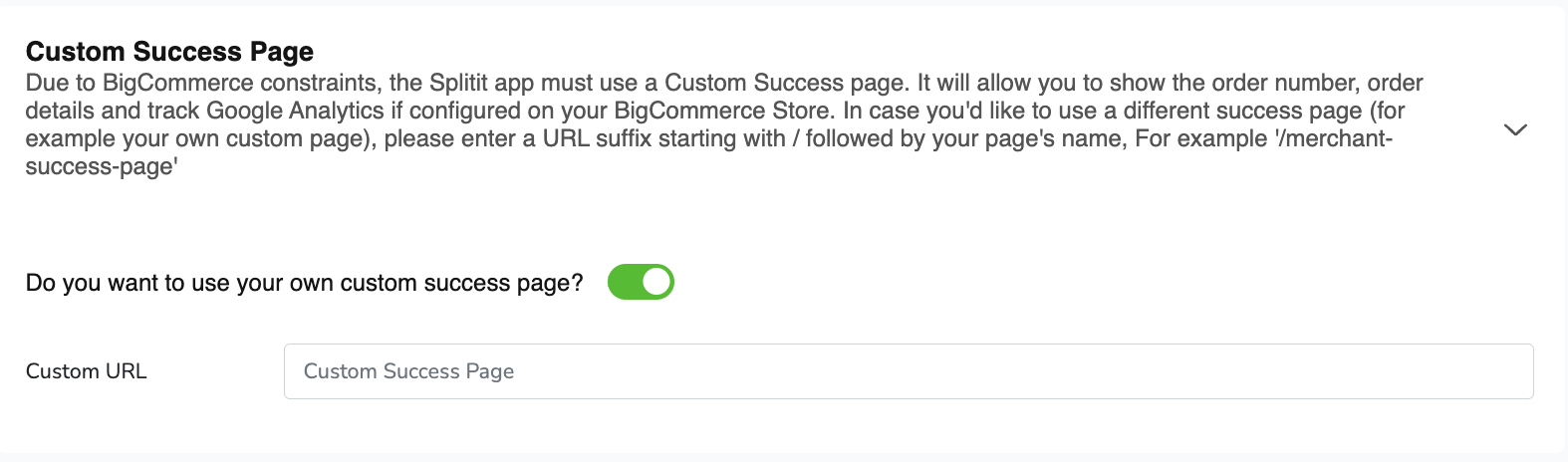
Custom Success Page
Unlike the system’s built-in payment methods, Splitit works with BigCommerce through an API. Because of this, once shoppers place an order, they don’t see an order placement success page but instead are redirected to the empty cart page. Thus you can enable your own success page to allow customers to see confirmation of the placed order.
Storefront Checkout
The Splitit payment method shows up on the storefront based on the enable/disable setting in the admin configuration.
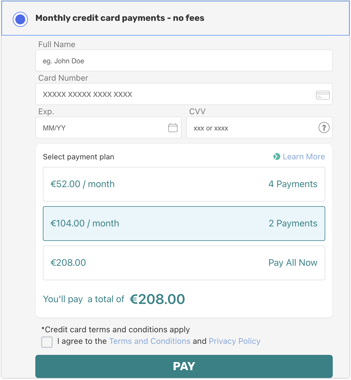
Customers can select installment plan duration based on the plugin's settings.
If the product amount lies outside of the amounts Range in settings, the Splitit payment method will not be shown.
If 3D secure is not enabled in the configuration and the transaction is successful when the "Pay" button is pressed, the user will be redirected to the order success page (if a custom order success page is enabled), or to an empty shopping cart (learn how to add a custom success page above). The customer will see an error message if the transaction is unsuccessful.
If 3D secure is enabled in the admin configuration, the user will see a popup after clicking the Pay button.
Once 3D secure verification is successful, the user will be redirected to the order success page (if a custom order success page is enabled) or to an empty shopping cart (see "Custom Success Page" above).
The user will see the error on the payment page if 3D verification fails.
Admin Panel
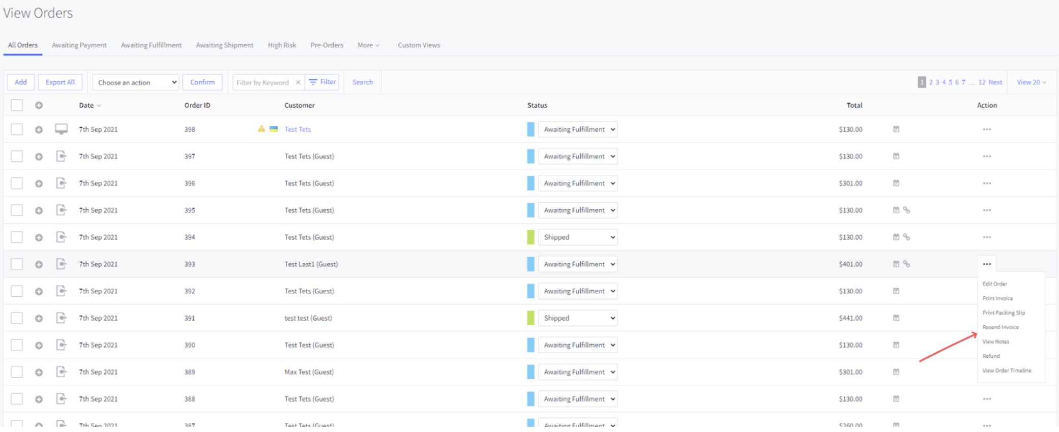
Admin Order Details
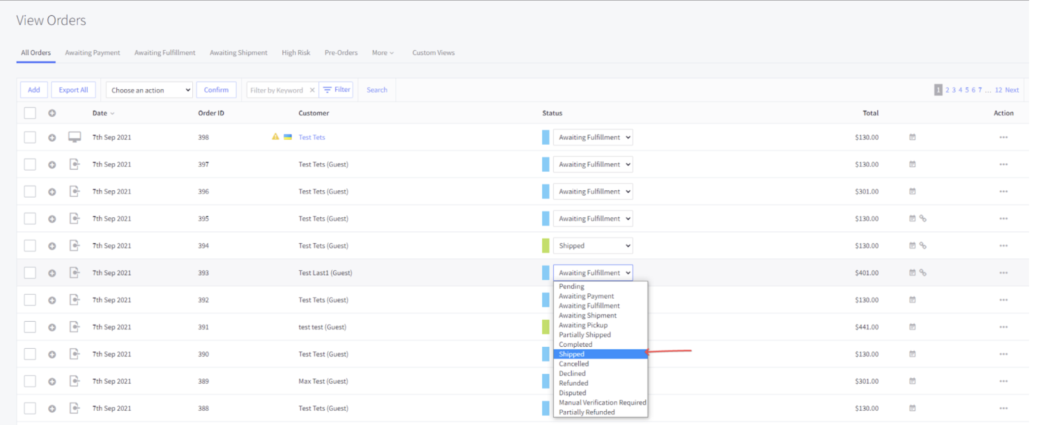
You can see order details in the BigCommerce admin.
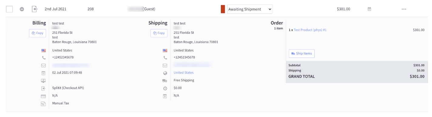
Note that orders that were created with AutoCapture set to off will be charged when the order is shipped. (See the "Configuration" section above.)
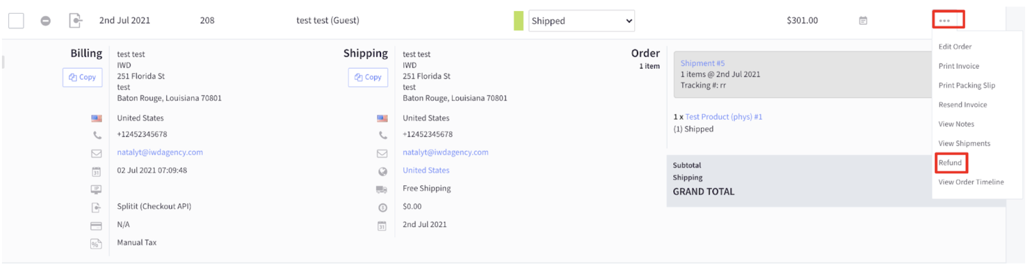
Admin Order Refund
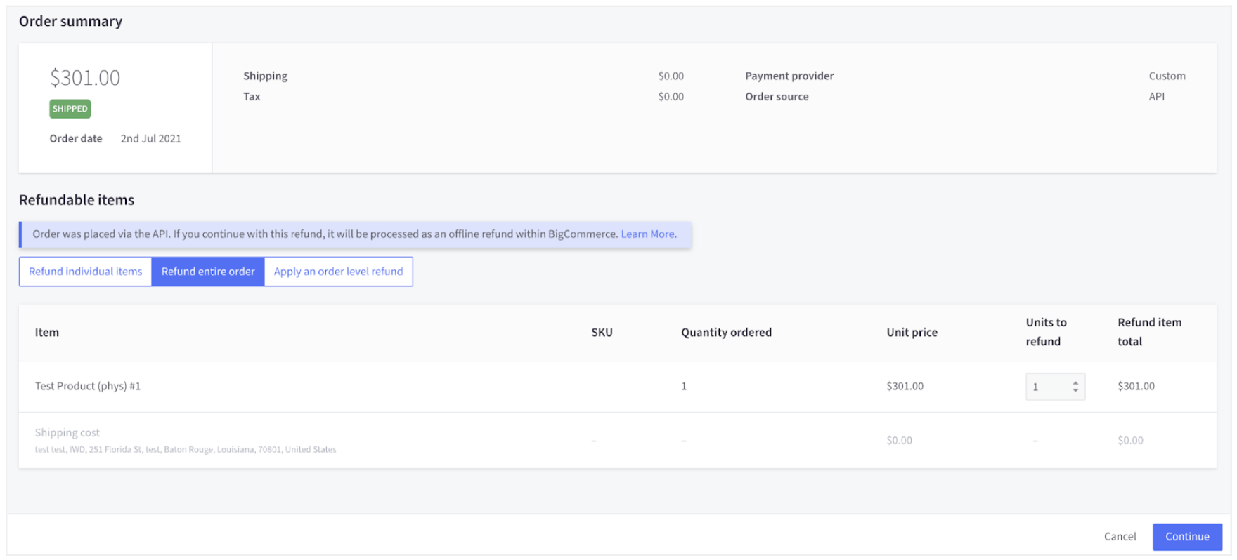
You can refund an order. To create a refund, open the order in the admin panel, then click on the Refund button.
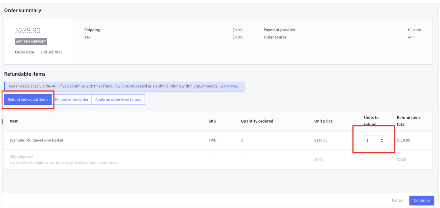
To create a partial refund click on Refund Individual Items. QTY can be specified to choose an amount to refund. Click on the Continue button.
Select one of the methods below to complete your refund:
- Store Credit - This amount will be credited to customer's account.
- Refund customer through third party provider - Refund will be processed externally to BigCommerce. Choose this option if you want to refund customers via Splitit.
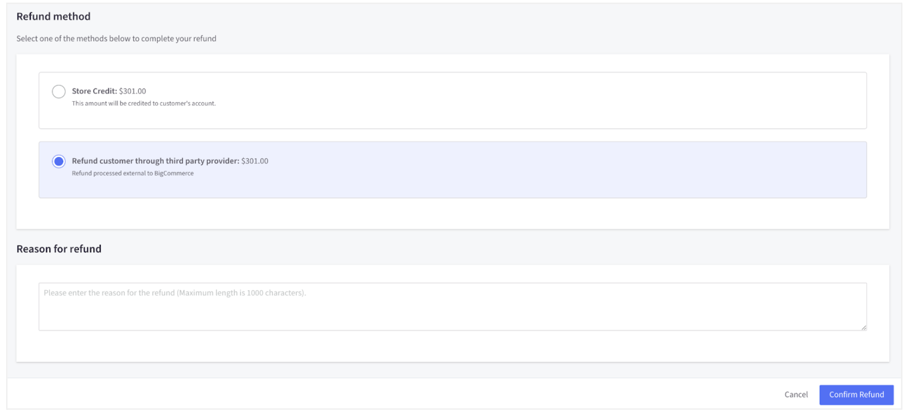
Add a reason (optional). Click on the Confirm Refund button. Order status will be changed to Partially Refunded.
To create a full refund choose Refund entire order.
Select one of the methods below to complete your refund:
- Store Credit - This amount will be credited to the customer's account.
- Refund customer through third party provider - Refund will be processed externally to BigCommerce. Choose this option if you want to refund customers via Splitit.
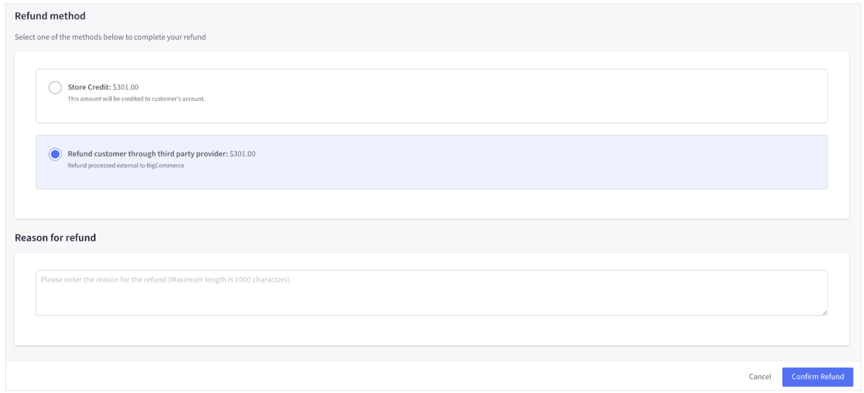
Add a reason (optional). Click on the Confirm Refund button. Order status will be changed to Refunded.
The customer will receive an email that the installation plan has been cancelled.
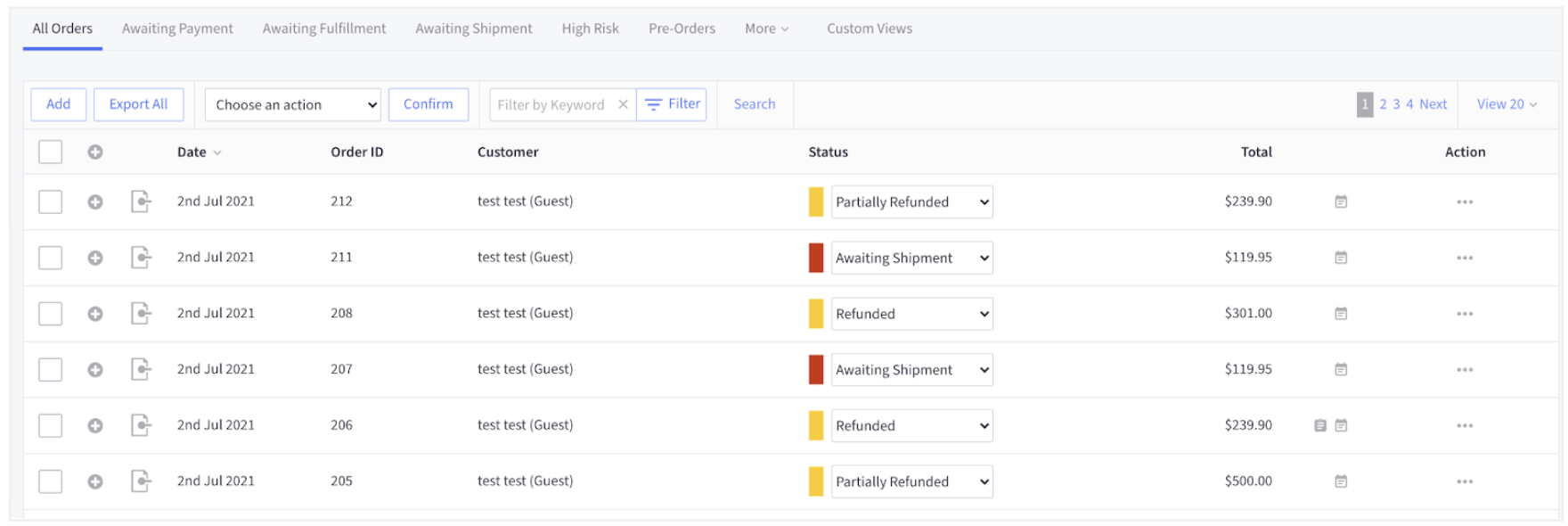
You can see the changes/order statuses in the BigCommerce admin:
Shipping Status for Physical/Digital Products
If the order contains both physical and digital products, then the ship items button will appear in the list of actions.
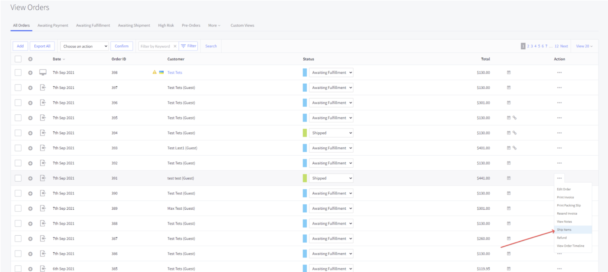
If the order contains only a digital product type, then the ship will not appear in the list of actions.
There is a webhook configured to change the order status to Shipped. As soon as the status is changed, it will run the start installments functionality.