SAP Commerce Cloud
Use the instructions below to enable the Splitit installments payment option in the payment and checkout experience on your SAP Commerce Cloud site, along with messaging that will introduce your customers to installment payment options early in their shopping experience.
Learn more about the benefits of adding Splitit to SAP Commerce Cloud: (https://www.sap.com/products/crm/partners/splitit-usa-inc-splitit-checkout-plugin.html?countryCode=US)
How the Checkout Process Works
The Splitit fields appear when "MONTHLY CREDIT CARD PAYMENTS - NO FEES" is selected at checkout:
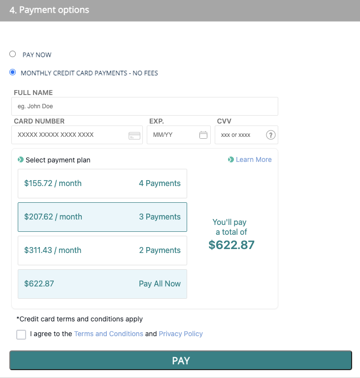
Customers can select installment plan duration based on your settings (note that if the product amount is out of your amounts ranges in settings, the Splitit payment method will not be shown).
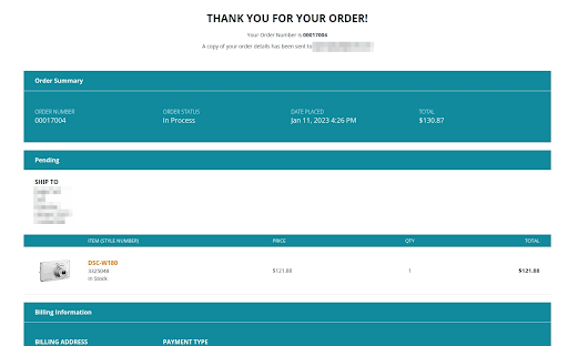
If 3D secure is not enabled in your configuration and the transaction is successful, the user will see a success page by clicking the Pay button. If the transaction isn't successful, the customer will see an error message.
If 3D secure is enabled in your admin configuration, the user will see a popup upon clicking the Pay button. Once 3D secure verification is successful, users will be redirected to the order success page.
If 3D verification fails, the user will see an error on the payment page.
Installation/Configuration
Connection Settings
- Log into your SAP Merchant Portal. Go to Administration Cockpit > Splitit and choose the account you would like to use. Pick My demo account for development and testing purposes and My live account for production.
Follow the steps to log in, choosing your merchant and terminal accounts.
Once the module has been installed successfully, the next step is to configure payments. Go to Administration Cockpit > Splitit and select Enabled for Enable/Disable Splitit Payments.
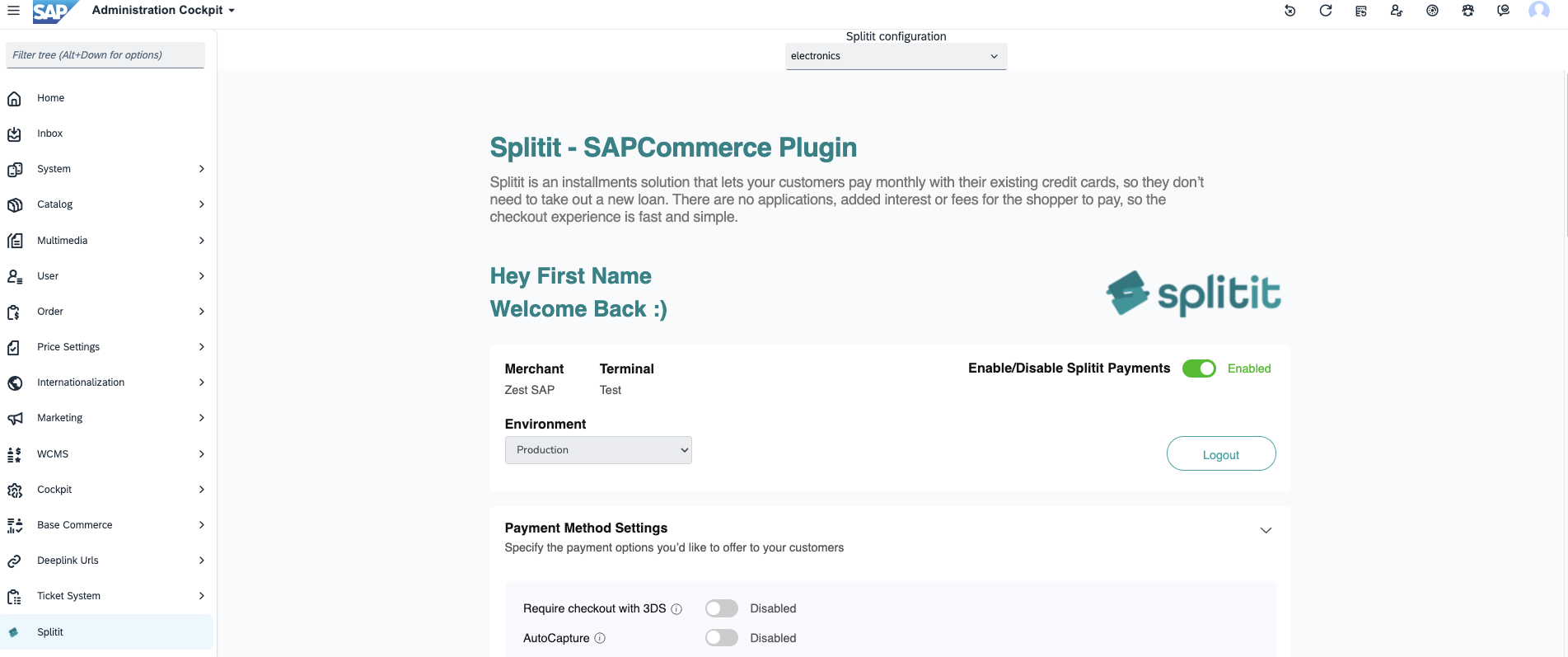
Environment: Splitit offers sandbox and production environments. If you are doing development work or testing, select Sandbox. If you are going live, select Production. (Note: this is the environment setting for SAP itself, but you also need to be signed into the correct environment in your Splitit merchant admin; you achieved this in Step 1 through the plugin but you can always sign directly into your Splitit merchant admin using its production URL or its sandbox URL.)
Once these settings have been entered, scroll down the page and click Save Changes.
Payment Method Settings
Next configure your Payment Method Settings in the second section.
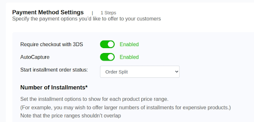
3DS On/Off
3D secure verification can be enabled or disabled for your store.
If Require checkout with 3DS is Enabled, the user must pass through 3D secure verification shown as a popup. It needs to be successful for them to place an order.
AutoCapture
AutoCapture refers to whether the first payment of an installment plan is just authorized upon checkout or is both authorized and captured.
Disabled – Only an authorization is performed when a customer makes a purchase. This ensures that the customer’s account has sufficient funds to complete the transaction. To capture money, a shipment will need to be created.
Enabled – Authorization is performed and once the payment is authorized, the capture process will begin. This will perform a capture to transfer funds from the customer's credit card to the merchant’s account.
Start installment order status
SAP is highly customizable, allowing you to create workflows using many different statuses. Set the status you will be using to start installments here.
Number of Installments
This configuration sets up your desired installment ranges based on order amount. It only accepts non-overlapping ranges. Note that you should only set three installment options per range.
For example, the following configuration is valid:
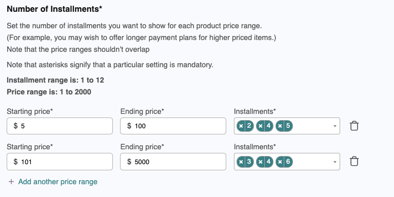
To add an installment configuration, click Add another price range, and enter the Starting price, Ending price and number of installments. The added range should not overlap the others. If you add an overlapping range, the system will show an error.
Correct configuration:
100-500 | 2, 3, 4
501-700 | 5, 6, 7
Wrong configuration (overlapping):
100-500 | 2, 3, 4
300-700 | 4, 7, 8
You can click the trash bin icon to remove a row.
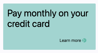
On-Site Messaging and Custom CSS
On-Site Messaging for SAP provides you with UI elements that you can use to inform your customers early on in their journey on your website that installments will be available at checkout. Available for you to add are strips, banners, logos and one liners. These can be added to your home page, cart page, and checkout page, as well as your catalog pages and product pages. To enable an element in a given location, toggle its switch on, and make sure to preview your changes in the admin. In most cases, you will also need to designate the HTML element on your page to which you would like to attach the On-Site element.
Strips
Strips appear on the top of bottom of a respective area (for this reason, you don't need to specify a specific HTML element to attach them to, unlike the other On-Site elements). With strips, you can set the main text and its alignment and font size, the button text, overall strip position, strip background color, button background color, button text color, and you can specify whether to hide or show the button (Hide Learn More), and whether to reverse the button's icon and text (Button Reverse Icon). Note that colors can be set by picker or with RGB, HSL, or HEX values (using the dropdown), and font sizes can be set as pixels or percentages.

Banners
Banners are related to strips but they are vertically oriented, add an optional title text, and don't stretch across an entire location, but are rather attached to an HTML element or elements using a CSS selector (e.g., ".yourClassName" or "#yourId"). With respect to banners, you can toggle the title on and off, set the title's text, size and color; set the main text along with its size and color; set the width (by pixels or percentage), height (by pixelsx or percentage), and background color of the banner itself; and finally you can set the background color and text color of the Learn more button, and also reverse the position of its icon. Note that colors can be set by picker or with RGB, HSL, or HEX values (using dropdown), and font sizes can be set as pixels or percentages.
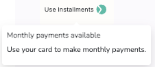
Logos
Logos are compact elements that let you display a message with a tooltip. The tooltip contains its own textual content as well as a link to a Learn more popup. For logos, you must specify the ID or class for the element(s) where you'd like attach them, and for your Home and Product pages, you can also specify an ID or class for sale items. For both sale and regular items, you should specify elements that contains prices in their bodies, so that a calculation can be properly provided, e.g., <div class="carousel__item--price">485.67</div>.
Additionally, for logos you can set the text and background color; you can toggle the tooltip off and on, and you can set the tooltip's text, font size and docking location; you can set the logo icon's color; and finally you can toggle the Learn more popup off and on. Note that colors can be set by picker or with RGB, HSL, or HEX values (using a dropdown), and font sizes can be set as pixels or percentages.
One Liners
One Liners let you show how much installments will be per month for a given item and they include a link to open a Learn more page. For one liners, you must specify the ID or class for the element(s) where you'd like attach them, and for your Home and Product pages, you can also specify an ID or class for sale items. For both sale and regular items, you should specify elements that contains prices in their bodies, so that a calculation can be properly provided, e.g., <div class="carousel__item--price">485.67</div>.
In addition, with respect to One Liners, you can choose the text option you'd like (you have four choices, or custom), the font size, whether to show the Learn more link, the color of the Learn more text and icon, and whether you'd like to show the icon. Note that colors can be set by picker or with RGB, HSL, or HEX values (using a dropdown), and font sizes can be set as pixels or percentages.
Custom CSS Settings
In addition to the preconfigured settings mentioned above, you have the option to add your own CSS properties to influence the styles of both On-Site Messaging (add these under On-Site Messaging CSS) and the checkout form (add these under Flex Fields CSS).
SAP Badges
You may wish to add badges within your SAP installation that advertise that a product is available for purchase. A full set of badges is downloadable below.
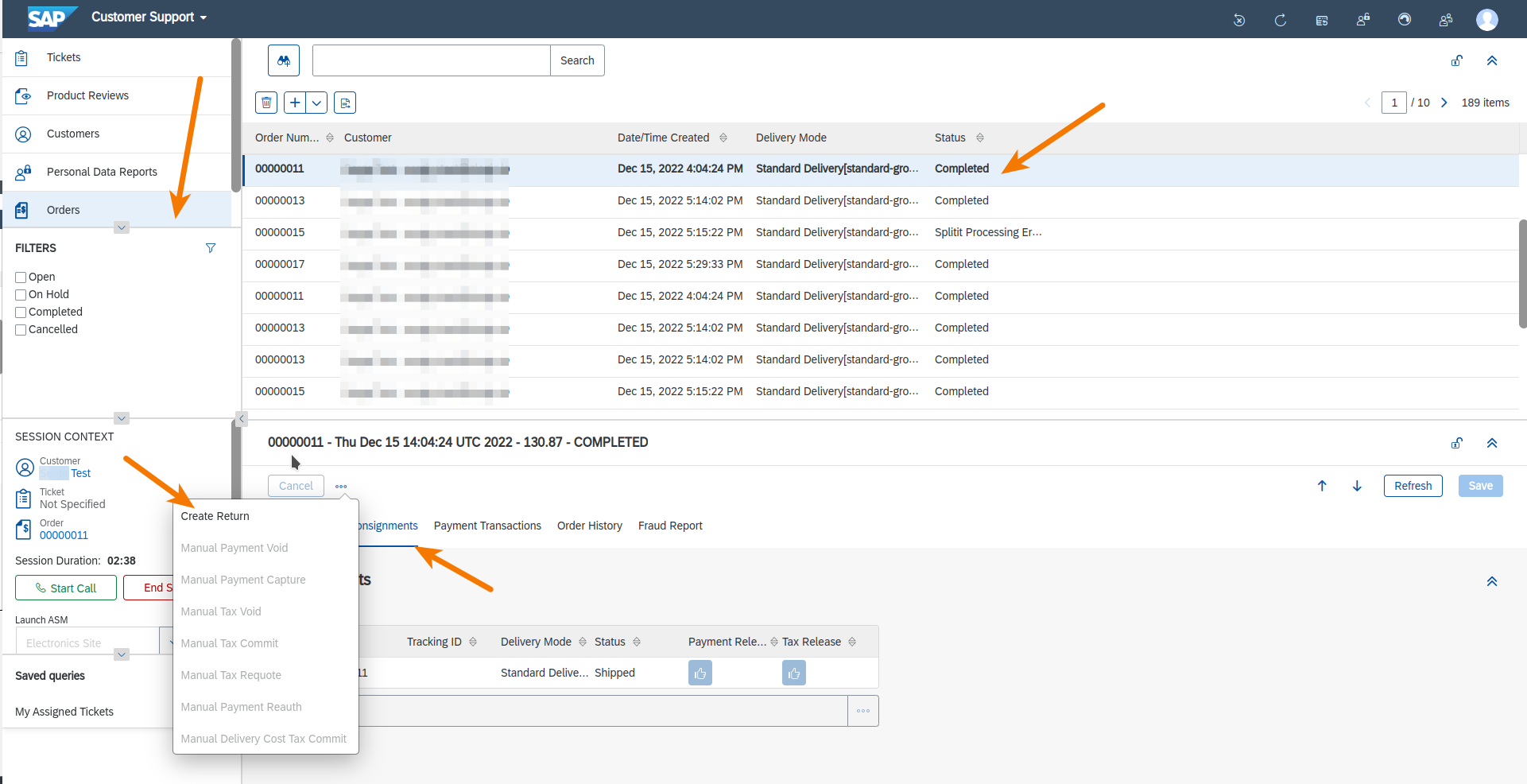
Admin Order Details
Admin Order View
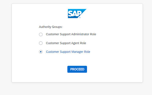
You can see order details in the SAP admin panel under Orders. Note that SAP uses separate admin accounts for extension configuration and order management. Orders must be managed using an account with the Customer Support Manager Role.
*With respect to your orders, remember that if Splitit AutoCapture is off, the installments won’t be started until the order is shipped, but if Splitit AutoCapture is on, the installments will be started automatically.
Admin Order Returns
You can return an order from your SAP admin panel, and the changes will be made automatically in Splitit.
To create a return, open an order in the admin panel, and click on the Return button.
You can choose the number of items to return and whether you need to refund shipping. Add a reason and click on Confirm Selected.
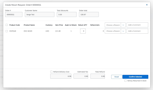
Partial Returns
A partial return will return the specified amount and keep the order open.
To create a partial return:
- Open the order
- Click on the Return button
- Choose QTY to return
- Specify the delivery cost to return if applicable
- Add a reason and click on the Confirm Selected button