WooCommerce
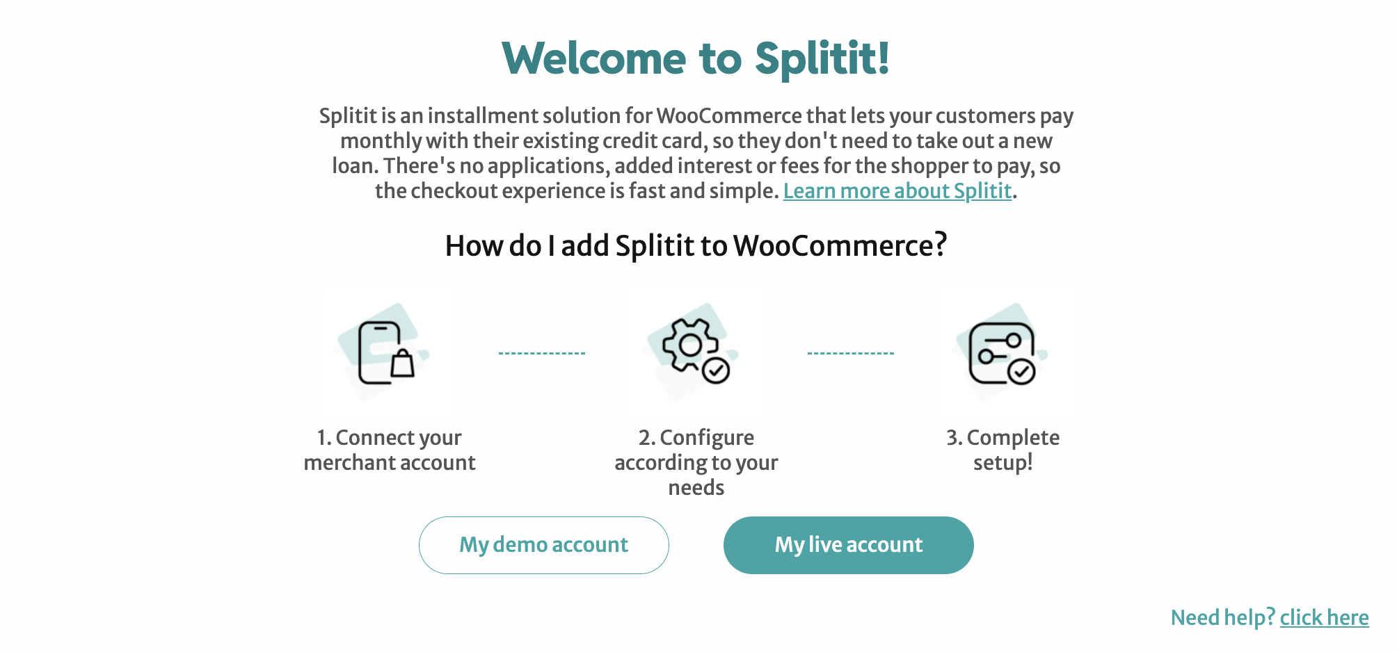
Use the instructions below to enable the Splitit installments payment option in the payment and checkout experience on your WooCommerce site, along with messaging that will introduce your customers to installment payment options early in their shopping experience.
Installation
Before installing, make sure your site meets the recommended WooCommerce requirements, as documented here.
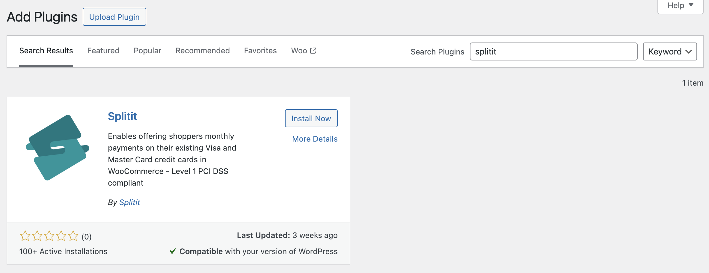
In your WordPress admin area select Plugins -> Add New and search for "Splitit" in the search bar.
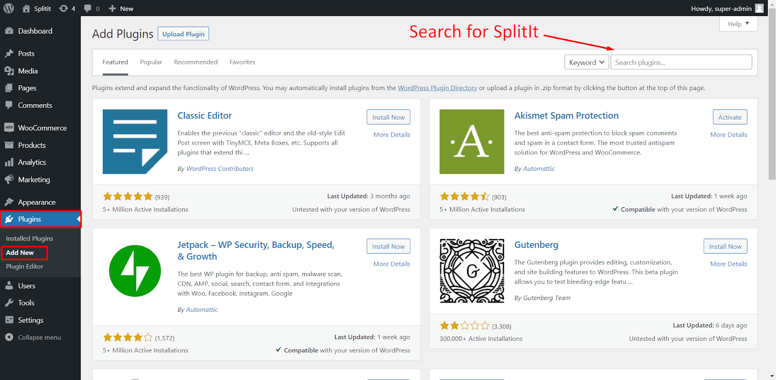
Once the Plugin has been located click the Install Now button and WordPress will download and install the plugin.
Once installed, the Install Now button will change to Activate. The Splitit plugin will be installed on your site, but it will not work until you activate it. Click on the Activate button to start using the plugin on your WordPress site.
Configuration
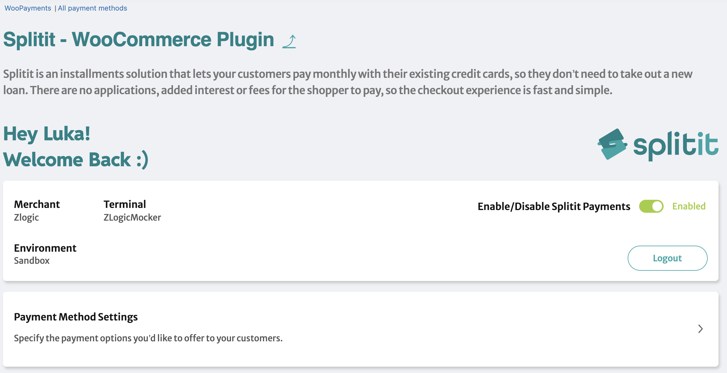
Once the module has been installed successfully, the next step is to configure payments. Go to
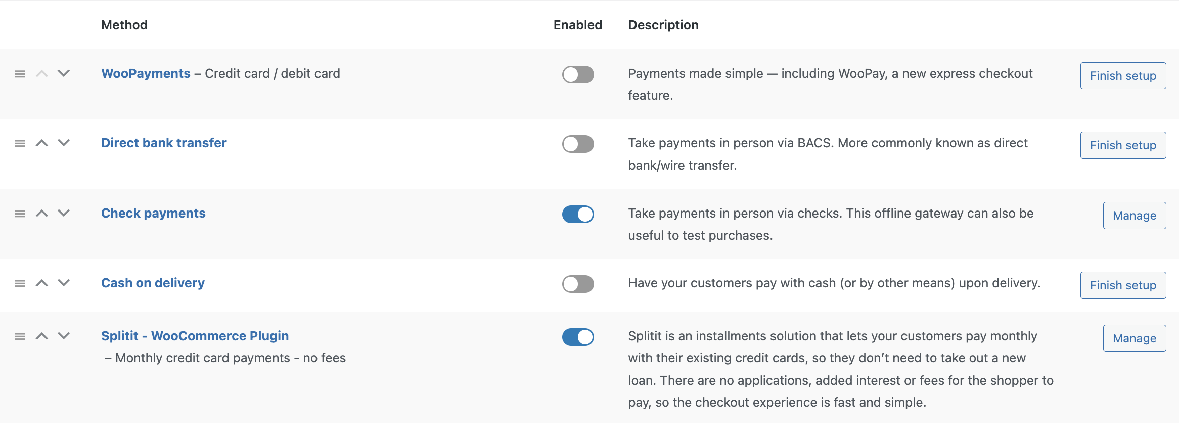
WooCommerce->Settings->Payments and toggle Enable/Disable Splitit Payments.
You can also change the order of a payment method by dragging and dropping the payment method to the desired position.
Connecting to Your Account
Please login to your merchant account before enabling the plugin. To do that click Login in the payment method configuration.
Then you will see a popup with two options: My demo account and My live account. Pick the one you need.
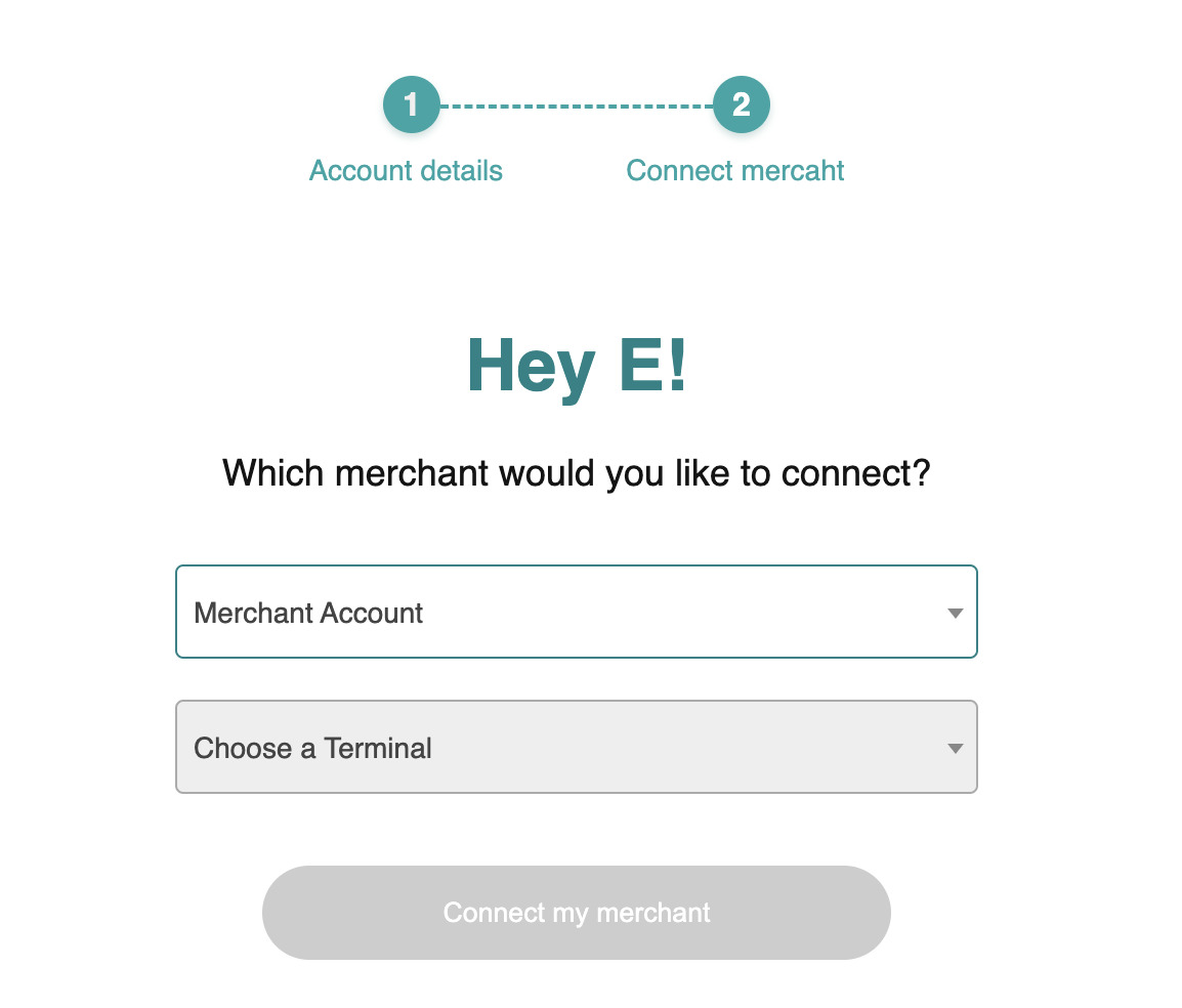
Then you’ll need to log into your merchant account on the Splitit site. Google login is also available.
Once logged in, pick Merchant Account, Terminal and Client ID from the dropdown options, and click Connect my Merchant. Then click Back to configuration to return to the extension settings.
Payment Method Settings
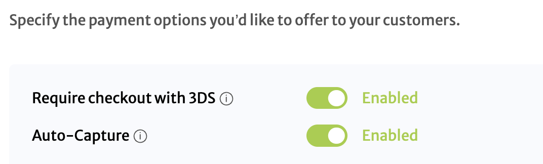
3DS On/Off
3D secure verification can be enabled or disabled in the configuration.
If “On” is selected, the user will be required to pass through the 3D secure verification which is shown as a popup. It needs to be successful to place an order.
AutoCapture
Off – Only authorization is requested when a customer makes a purchase. This ensures that the customer’s account has sufficient funds to complete the transaction. To capture money, a shipment needs to be created.
On – Authorization is requested. Once the payment is authorized, the capture process will begin. This will perform a capture to transfer funds from the customer's card to the merchant’s account.
Number of Installments
This configuration sets up installment ranges that are desired based on the order amount. This setting only accepts numbers and non-overlapping ranges. For example, the following configuration is valid:
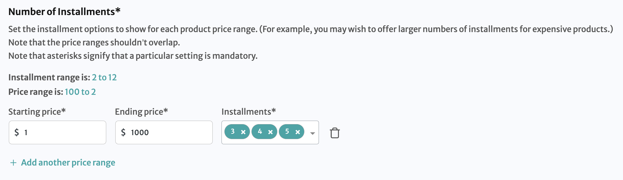
To add an installment configuration, enter the Starting price, Ending price, and number of Installments.
Click Add another price range to add multiple rows.
Click the Remove icon to remove the row.
Important: The added range should not overlap. If you add an overlapping range it will throw an error.
Wrong configuration:
100-500 | 2,3,4
300-700 | 4,7,8
Correct configuration:
100-500 | 2,3,4
501-700 | 5,6,7
Set On-Site Messaging Options
On-Site Messaging shows Splitit graphics throughout your website with installment breakdowns. The On-Site messaging settings manage the display of the available installments.
The area is divided into five sections, so it is possible to configure settings separately for the Home Page, Shop Page, Product Page, Cart Page, and Checkout Page.
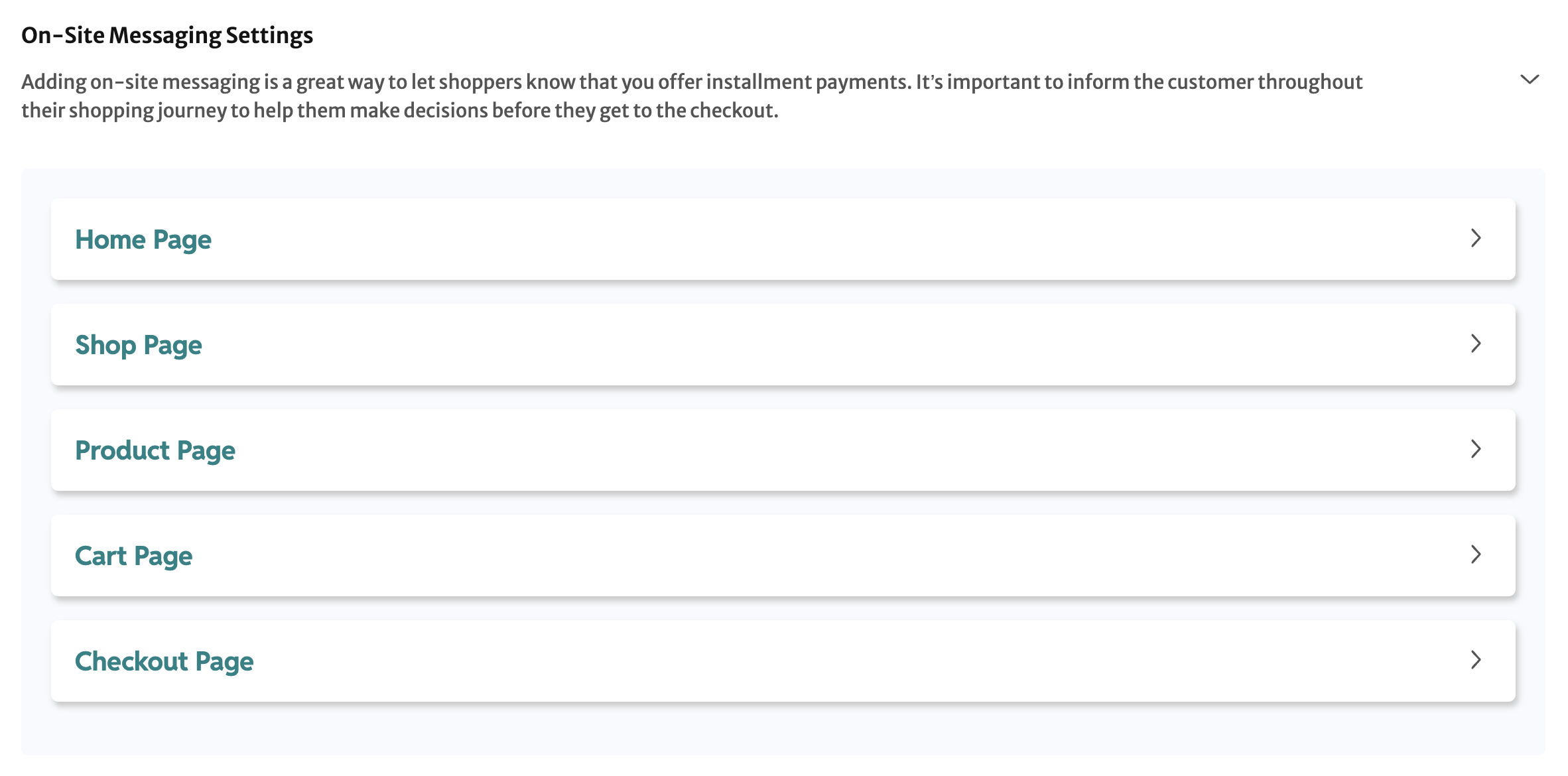
The elements you can set are Strips, Banners, Logos, and One Liners. Note that Logos and One Liners cannot be configured for the Home Page, because they require prices to calculate the payments schedule, and prices are absent on the homepage of a store built using WooCommerce.
Strips
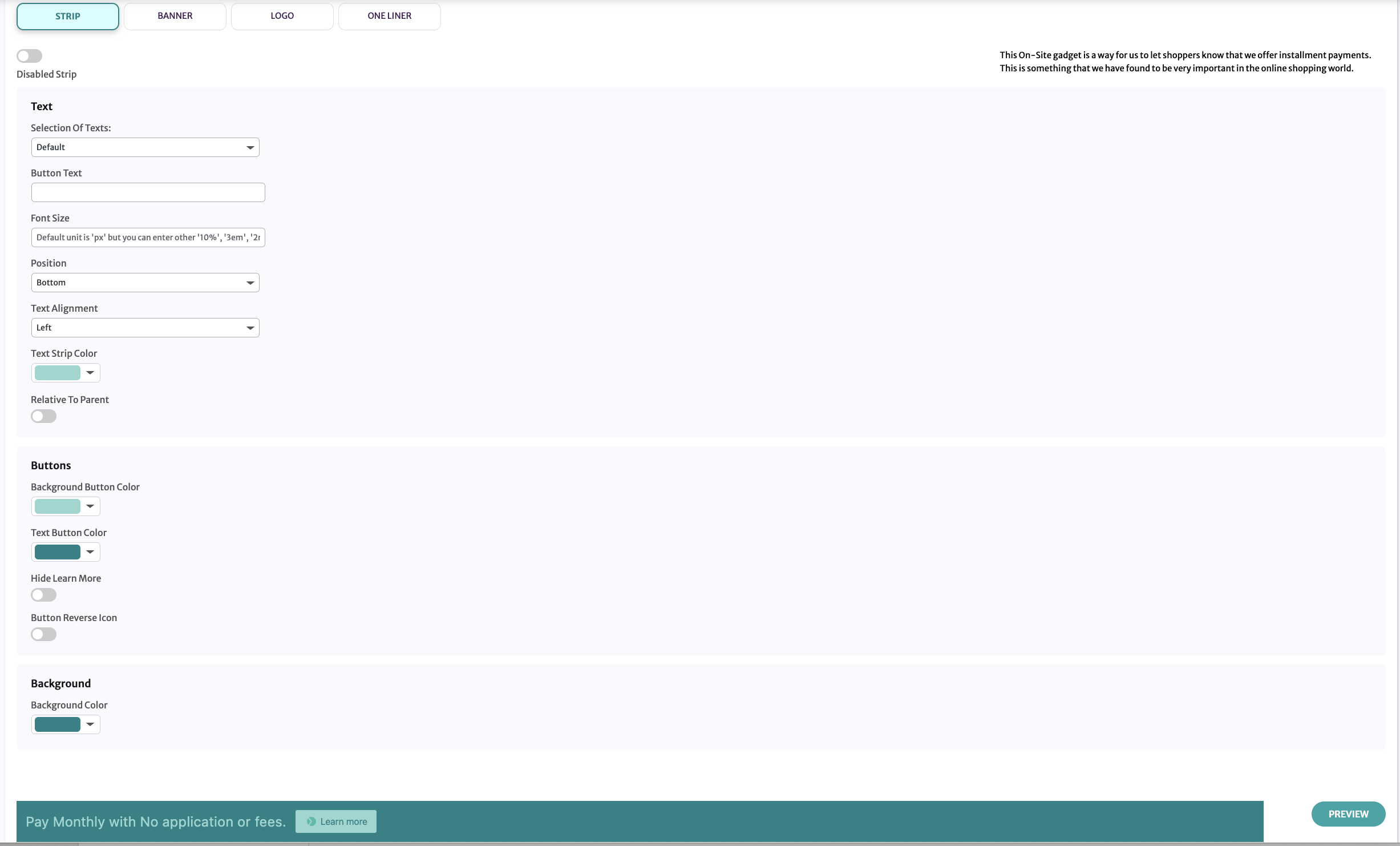
Enabled Strip/Disabled Strip- this switch allows to turn on or off the message type for the current page type. Only one message type can be enabled for the current page type.
Selection Of Texts- Default: the strip uses the default message. Other: allows you to enter your own message.
Font Size- You can enter the font size. Default value is in pixels, but you can specify other measurements, like percent.
Position- The strip can be positioned on the page's top or bottom.
Text Alignment- The text can be centered or located at the left or right edges of the strip.
Text Strip Color- The color of the text on the strip. It can be selected by color picking or by entering RGB, HSL, or HEX values. To switch from RGB to any other mode, click on the letters RGB.
Background Button Color - The color of the button that contains the Learn More link. It can be selected by color picking or by entering RGB, HSL, or HEX values. To switch from RGB to any other mode, click on the letters RGB.
Text Button Color - The Learn More link text color. It can be selected by color picking or by entering RGB, HSL, or HEX values. To switch from RGB to any other mode, click on the letters RGB.
Hide Learn More - The switch enables or disables the Learn More button.
Button Reverse Icon - The switch changes the order of the Splitit logo and text Learn more on the link.
The Preview button applies the changes to the message example that can be seen on this page.
Banners
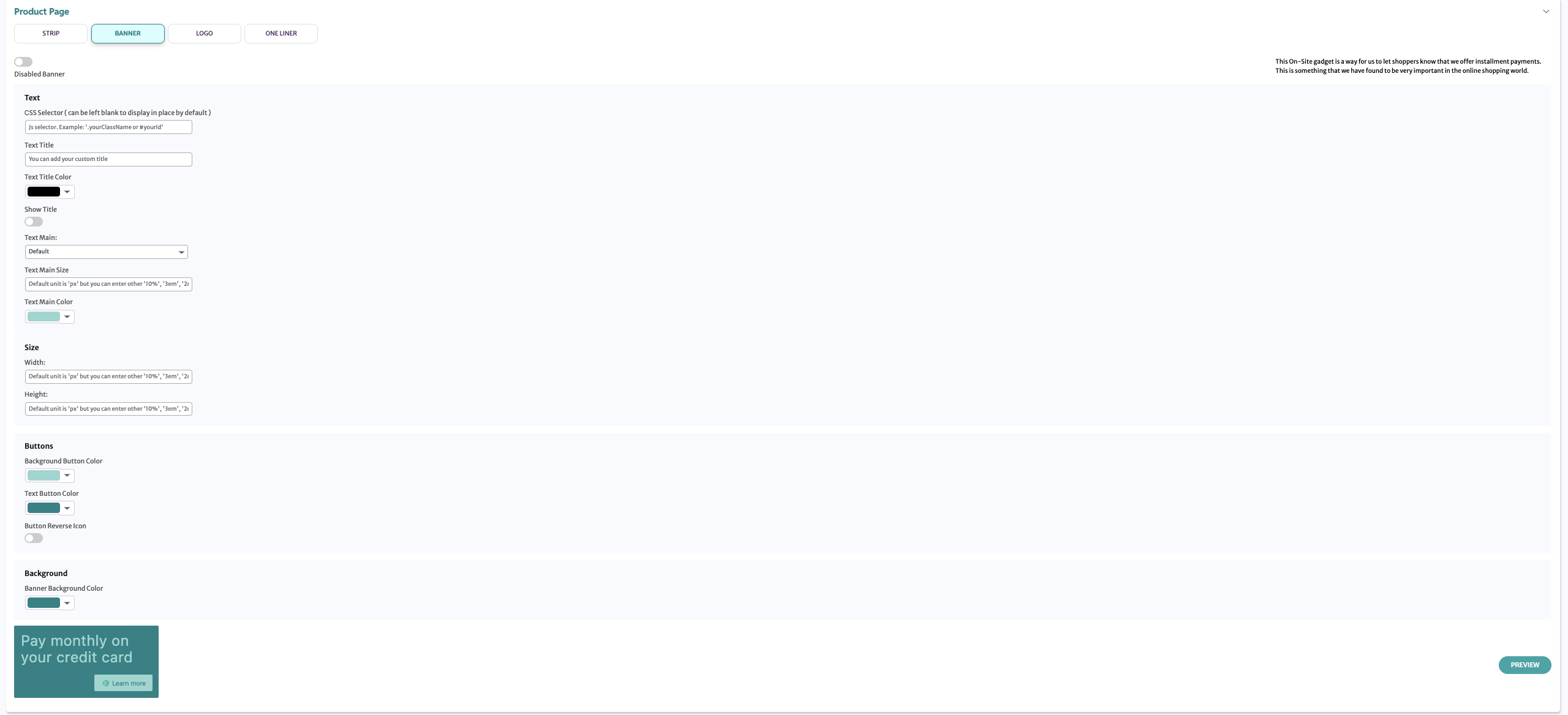
Enabled Banner/Disabled Banner - This switch allows you to turn on or off the message type for the current page type. Only one message type can be enabled for the current page type.
Text Main- Default: The banner uses the default message. Other: Allows you to enter your own message.
Text Main Size-You can enter the font size. Default value is in pixels, but you can specify other measurements, like percent.
Text Main Color- The color of the text on the banner. It can be selected by color picking or by entering RGB, HSL, or HEX values. To switch from RGB to any other mode, click on the letters RGB.
Banner Size. Width and Height-You can enter the overall banner size. Default value is in pixels, but you can specify other measurements, like percent.
Banner Background Color-The color of the stripe. It can be selected by color picking or by entering RGB, HSL, or HEX values. To switch from RGB to any other mode, click on the letters RGB.
Background Button Color-The color of the button that contains the Learn More link. It can be selected by color picking or by entering RGB, HSL, or HEX values. To switch from RGB to any other mode, click on the letters RGB.
Text Button Color-The Learn More link text color. It can be selected by color picking or by entering RGB, HSL, or HEX values. To switch from RGB to any other mode, click on the letters RGB.
Button Reverse Icon- The switch changes the order of the Splitit logo and text Learn more on the link.
The Preview button applies the changes to the message example that can be seen on this page.
Logos
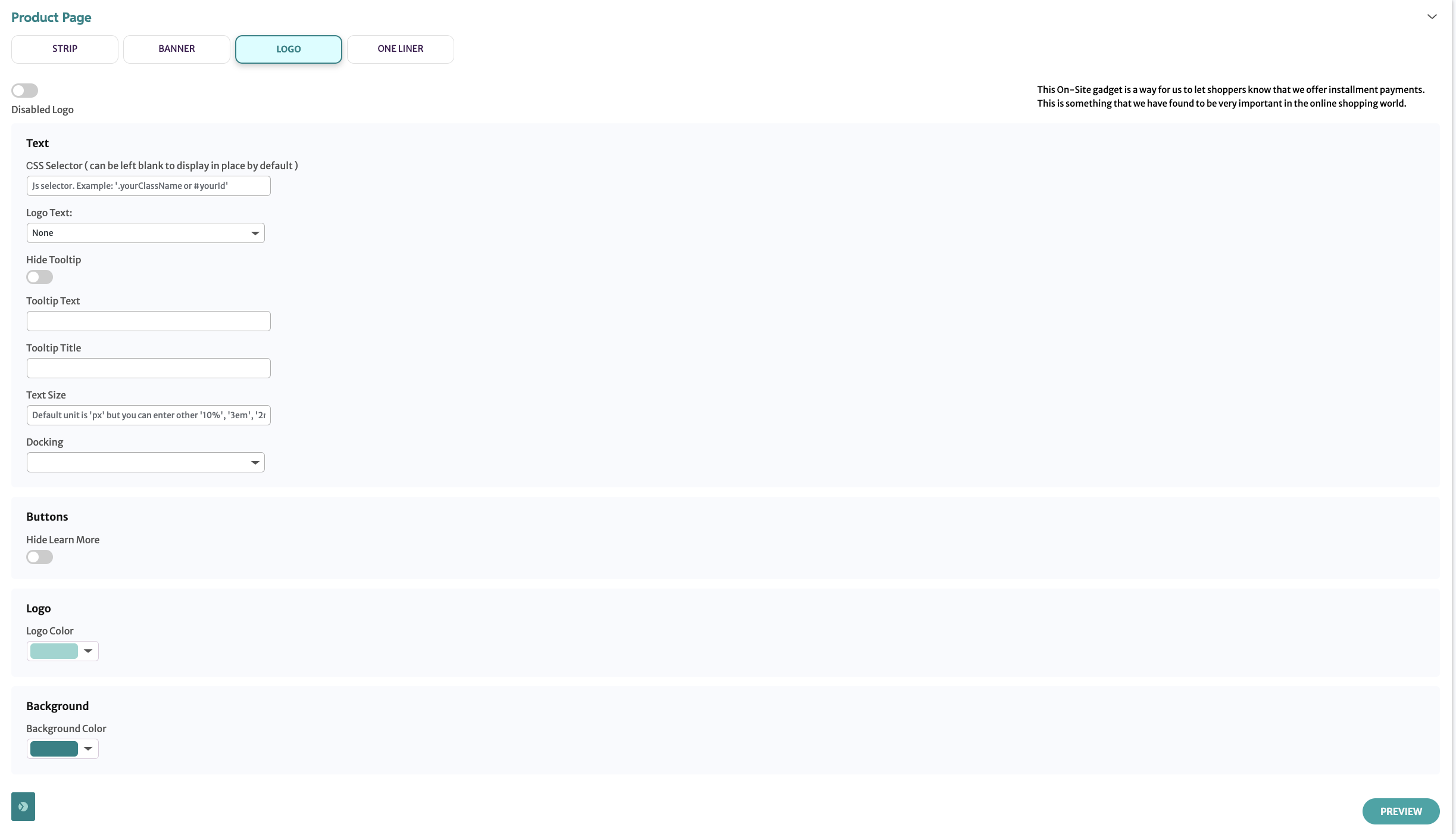
Enabled Logo/Disabled Logo-This switch allows you to turn on or off the message type for the current page type. Only one message type can be enabled for the current page type.
Logo Text-None: the text near the logo is absent. Other: allows you to enter your own message.
Hide Tooltip-This switch disables the tooltip, which by default shows up when a customer moves the mouse over the logo.
Tooltip Text-An option that allows setting custom text for the tooltip, which by default shows up when a customer moves the mouse over the logo.
Font Size-You can enter the font size. Default value is in pixels, but you can specify other measurements, like percent.
Docking-The relative position of the logo.
Hide Learn More-The switch enables or disables the Learn More link in the tooltip.
Logo Color-The color of the logo. It can be selected by color picking or by entering RGB, HSL, or HEX values. To switch from RGB to any other mode, click on the letters RGB.
Background Color-The color of the small square area around the logo. It can be selected by color picking or by entering RGB, HSL, or HEX values. To switch from RGB to any other mode, click on the letters RGB.
The Preview button applies the changes to the message example that can be seen on this page.
One Liner
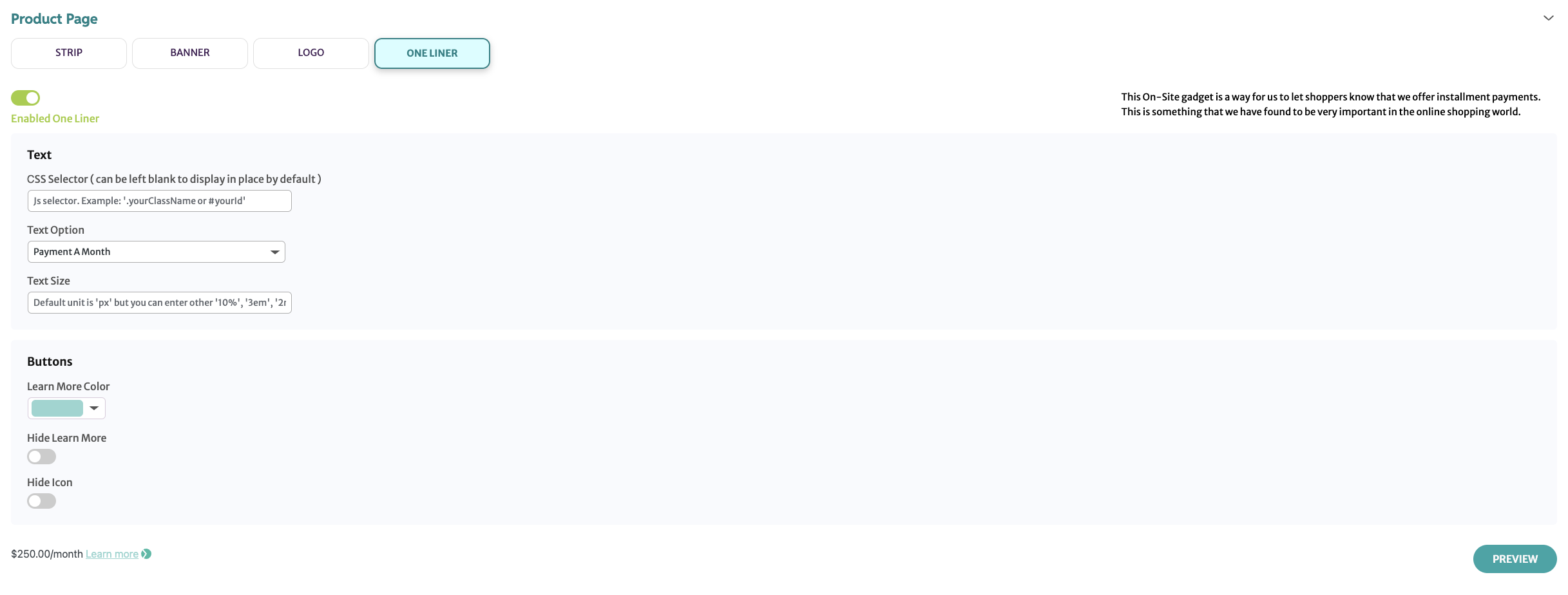
Enabled One Liner/Disabled One Liner - This switch allows you to turn on or off the message type for the current page type. Only one message type can be enabled for the current page type.
Text Option-A parameter that allows you to configure text for the one liner. Four built-in options are available, but you can also configure your own text.
Font Size-You can enter the font size. Default value is in pixels, but you can specify other measurements, like percent.
Hide Learn More- The switch turns on or off the Learn More link. The Splitit logo stays visible.
Learn More Color- The color of the Learn More link. It can be selected by color picking or by entering RGB, HSL, or HEX values. To switch from RGB to any other mode, click on the letters RGB.
Hide Icon-This switch hides the Splitit logo. The Learn More link stays visible.
The Preview button applies the changes to the message example that can be seen on this page.
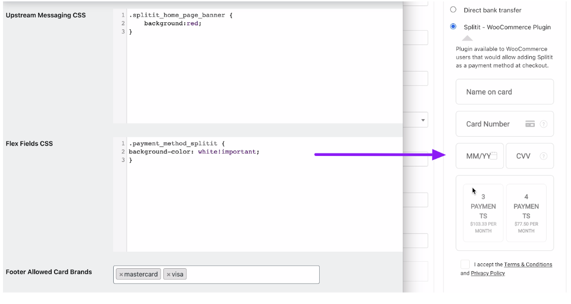
On-Site Messaging CSS
This block allows CSS customization of the Splitit On-Site Messaging blocks.
Flex Fields CSS
This block allows customization of the Splitit block at the checkout page.
Storefront Checkout
The Splitit Payment method shows up on the storefront based on the enable/disable settings in the admin configuration.
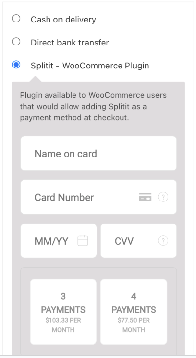
Customers have the ability to select the installment plan duration based on plugin settings.
If a product amount is out of the amounts Range in settings, the Splitit payment method will not be shown.
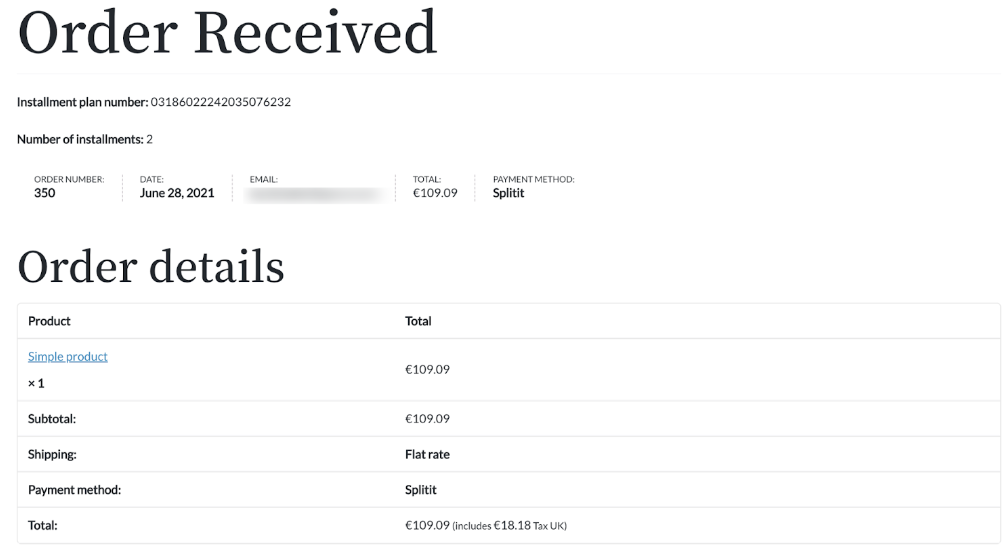
If 3D secure is not enabled in admin configuration and if the transaction is successful, the user will see a success page upon clicking the Proceed to Splitit button. If the transaction isn't successful, the customer will see an error message.
If 3D secure is enabled in the admin configuration, the user will see a popup after clicking on the Proceed to Splitit button.
Once the 3D secure verification is successful, the user will be redirected to the order success page.
If the verification fails, the user will see the error on the payment page.
Admin Panel
Admin Order Details
You can see order details in the WooCommerce admin.
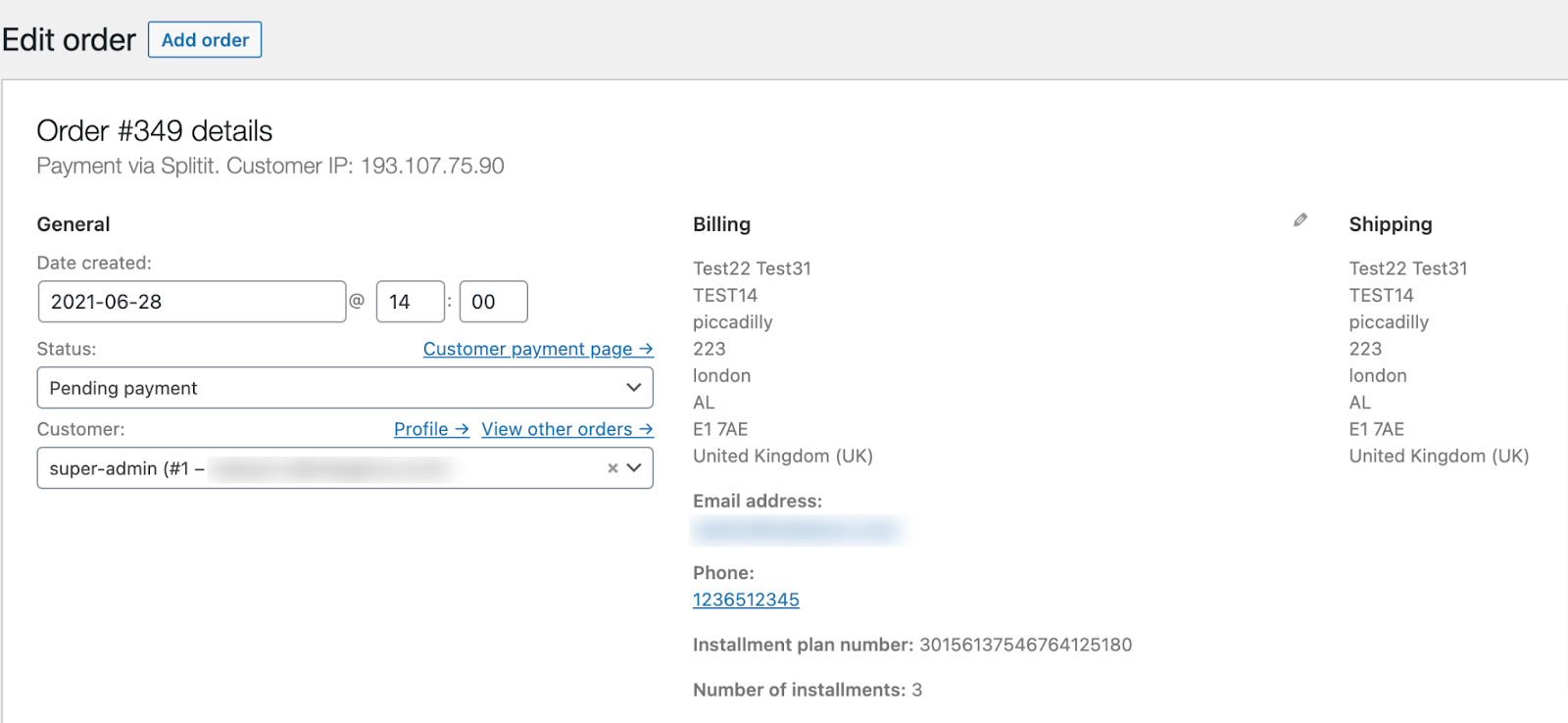
If Splitit AutoCapture is off, order status will be Pending. To capture money, click on the SHIP button.
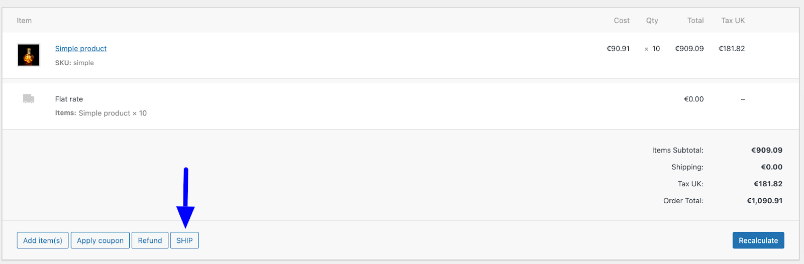
This will start installments and capture money. The order status will be changed to Processing.
If Splitit AutoCapture is on, order status will already be Processing.
Admin Order Refund
Admin can refund an order:
Refund manually (cash) - create manual refund without changing status in Splitit.
Refunding manually is not recommended as it changes the status of the order in WooCommerce and doesn't refund transactions in the Splitit account. Use this type of refund for cash refunds only.
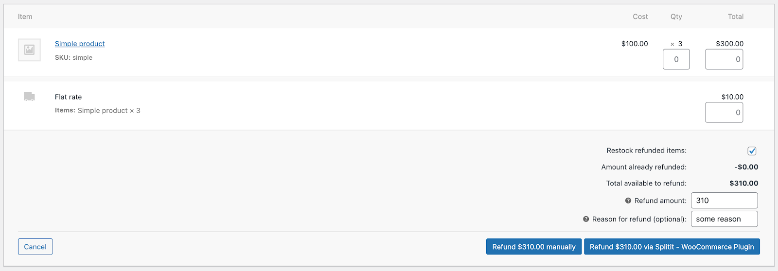
This supports both full and partial refunds.
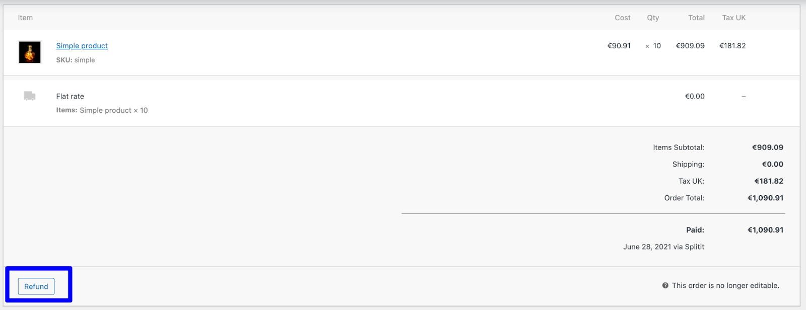
Full refund will refund the total amount and will close the order (refunded status). To create a refund, open the order in the admin panel, and click on the Refund button.
Additional QTY boxes will be available to choose an amount to refund. Add a reason and click on the Refund via Splitit button.
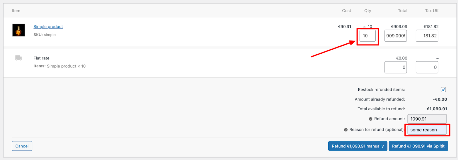
The customer will receive a message that the installment plan has been cancelled and order status will be changed to refunded.
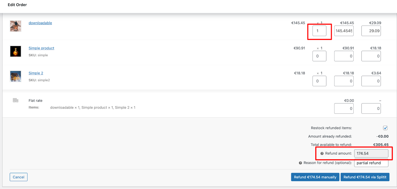
Partial refund will refund the specified amount and keep the order open.
To create a partial refund:
- Open the order
- Click on the Refund button
- Choose QTY to refund
- Specify Shipping amount to refund if applicable.
- Add a reason and click on the Refund via Splitit button.
NOTE: Order status will not be changed, only the amount.
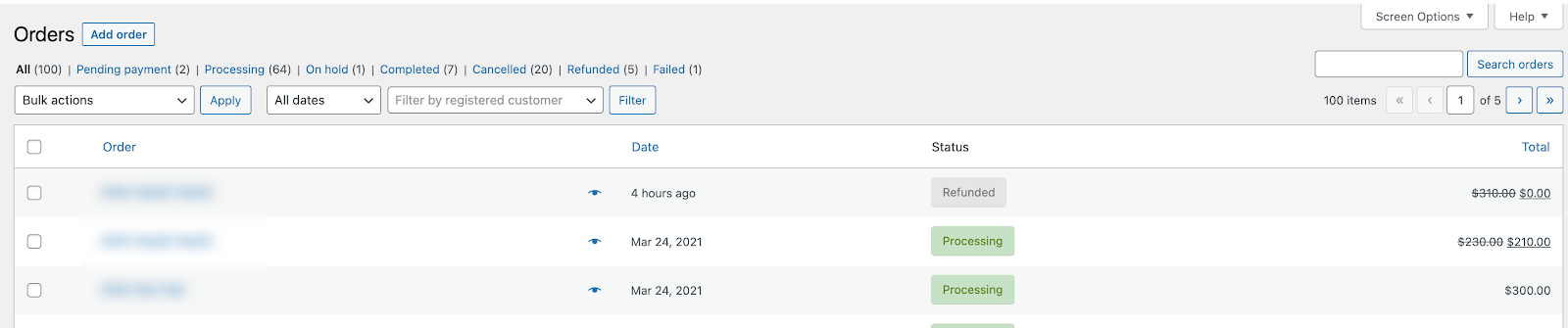
Admin can see changes/order statuses in WooCommerce admin:
Admin Order Cancel
Cancellations aren't a feature of the plugin (it's best to use a full refund per the section above), but you can use a third-party plugin to effect them (for example, something like "WC Cancel Order").