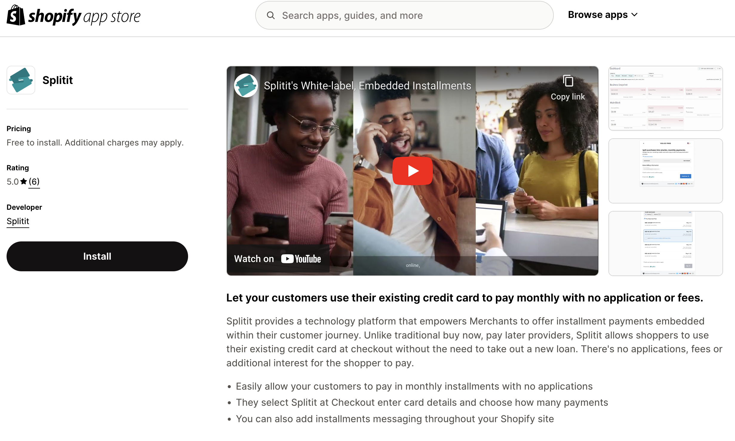
Shopify Installments — Installation Guide
Adding Splitit payments to your Shopify store will let your customers use their existing credit cards to pay for items with interest-free monthly installments. Splitit is added using Shopify apps and a new payment method, and it functions by providing your users a Splitit form for checkout.
Checkout Flow
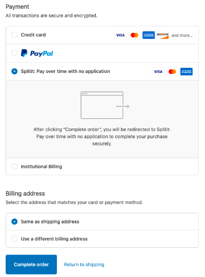
The shopper begins by selecting Splitit as a payment option:
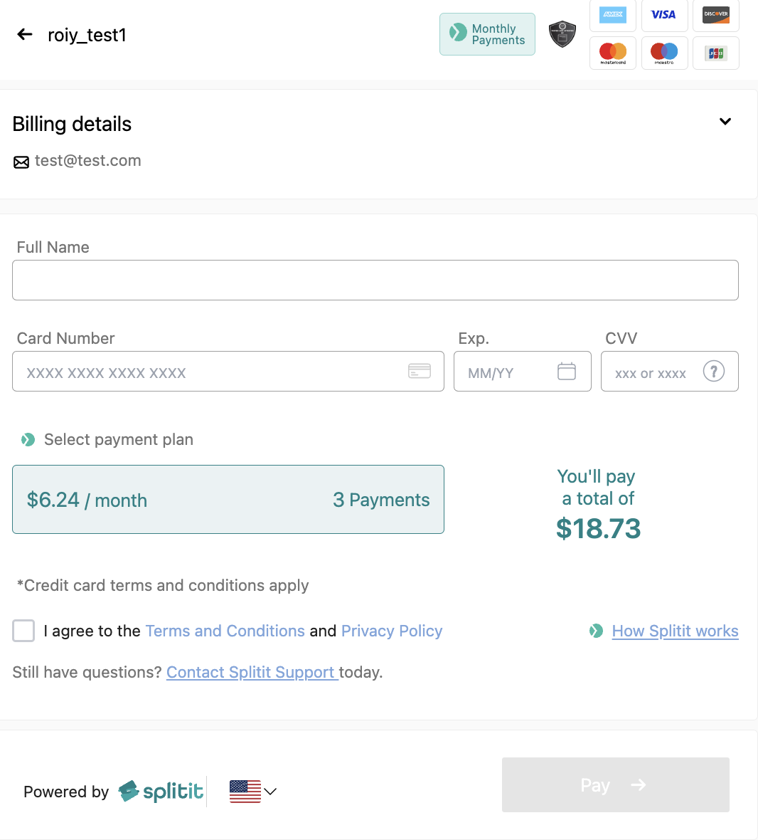
The shopper then uses a Splitit checkout form to complete their order:
About On-Site Messaging
In addition to Shopify checkout, you can add installments messaging throughout your Shopify site so that your shoppers are made aware early in their experience that they will have the option to pay in installments at checkout.
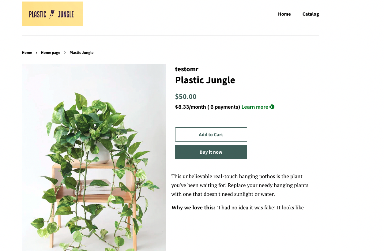
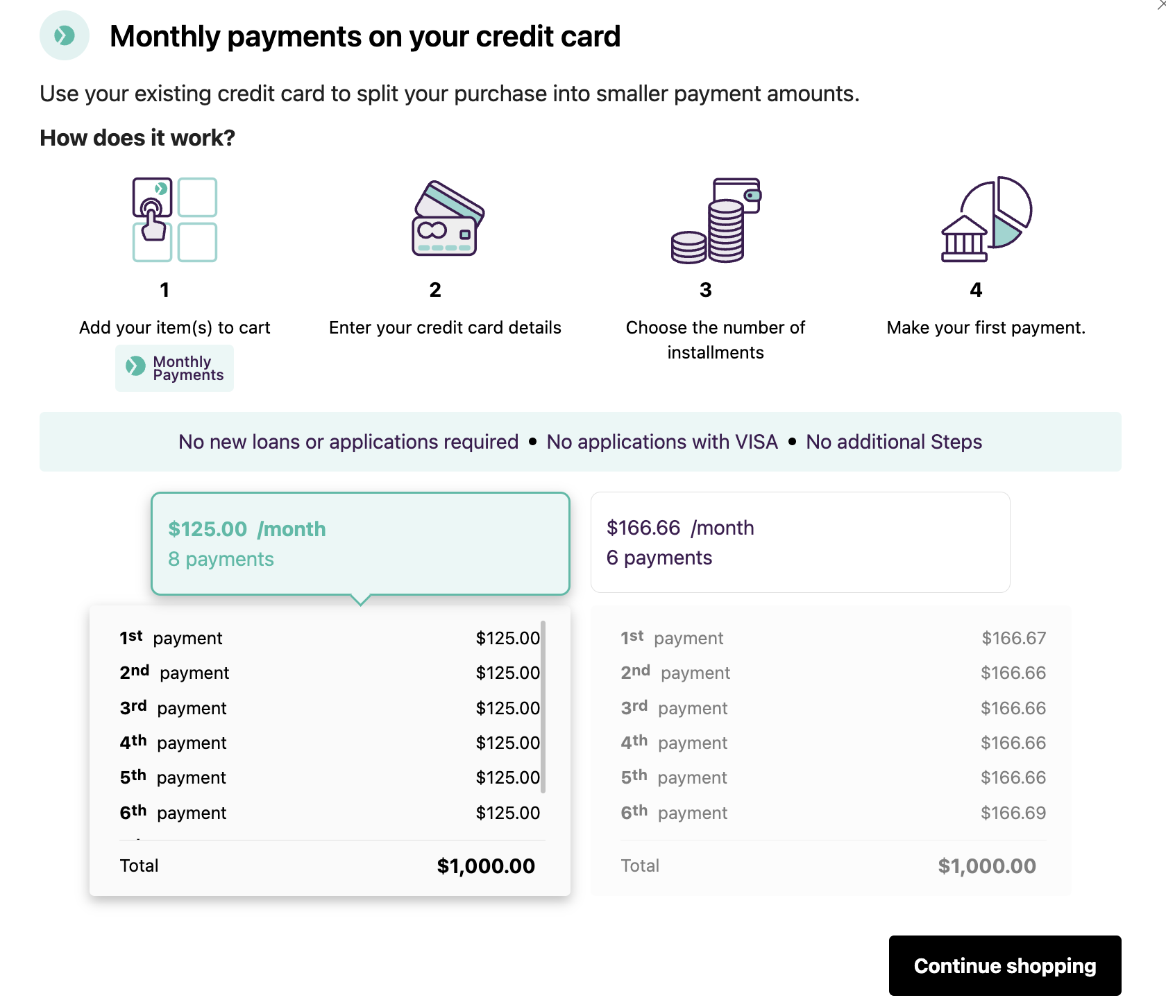
On-Site messages include a Learn more link, which displays information about potential plans in a popup:
Installation
Before beginning your Shopify installation, make sure you have signed up for a production Splitit account.
Add Splitit Checkout
1. Log into your Splitit Hub (if you aren't already logged in) using either your credentials or Google OAuth.
2. Proceed to the Splitit app's page on Shopify.
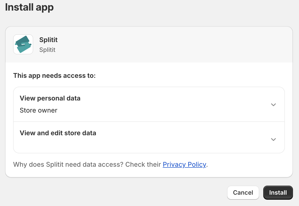
Click Install (if you are already logged into your Shopify account), or click Log in to Install, then select your Shopify account.
3. On the next screen (in your store's admin), click Install:
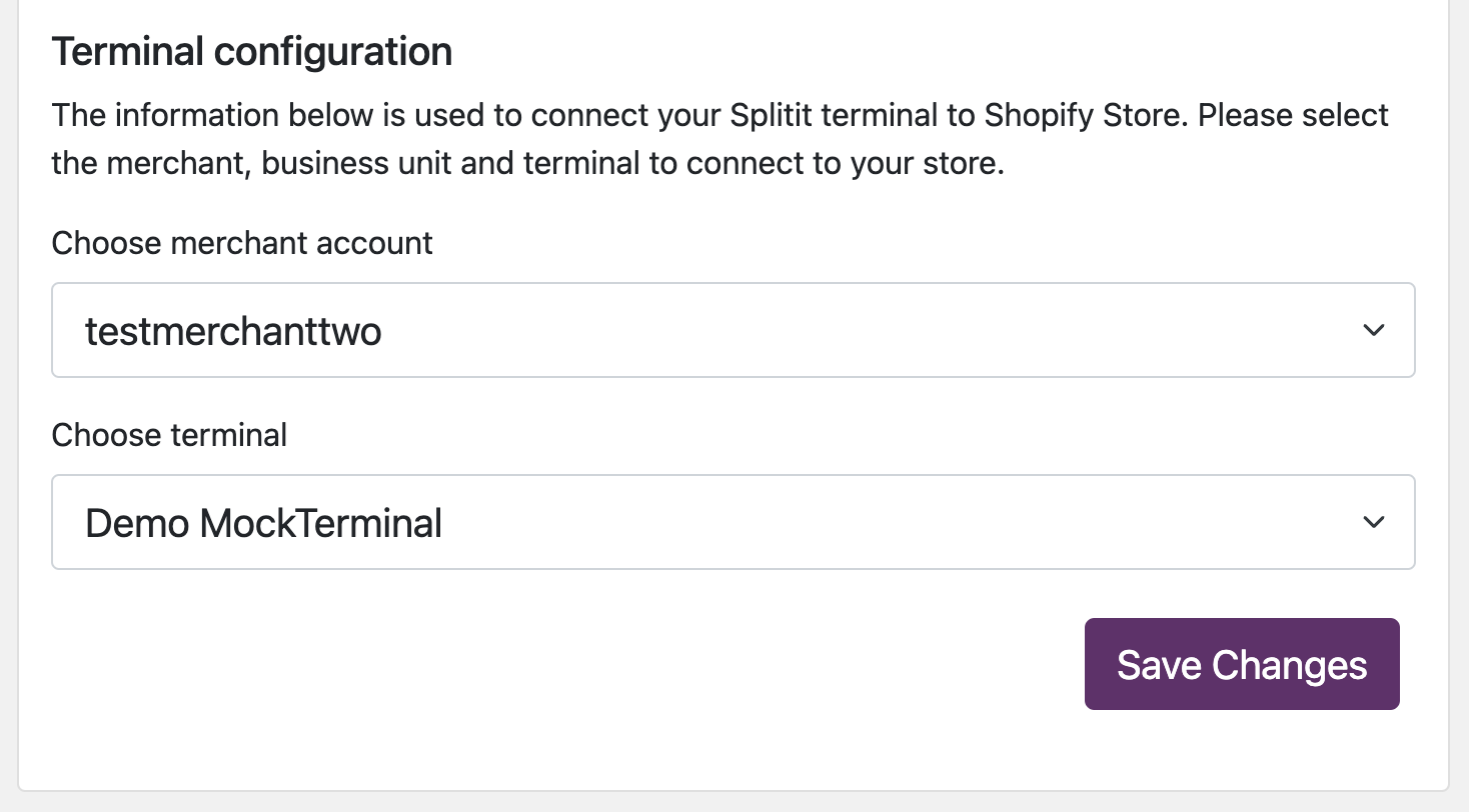
4. You will be directed to another screen in the Shopify portal where you will need to choose your merchant account, then your terminal. Finally click Save Changes.
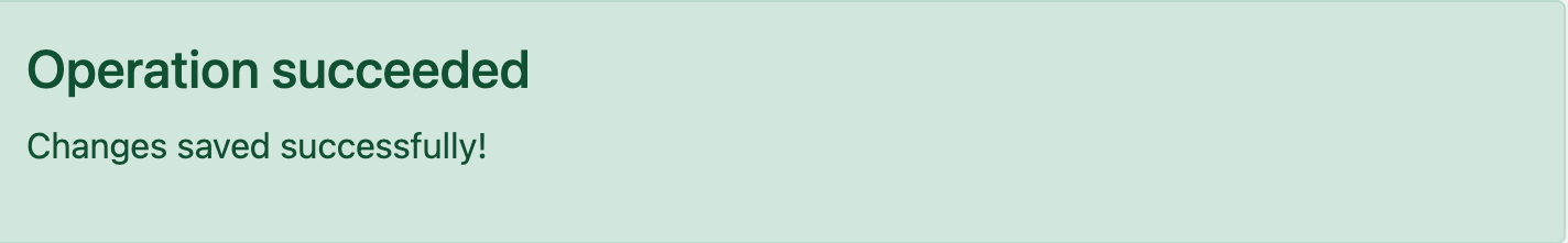
You will get a success message:
5. Click on the bar that appears above : Next step: Activate Splitit in Shopify payment settings:

(Note that this bar takes you to the URL yourstore.myshopify.com/admin/settings/payments/alternative-providers/1057713).
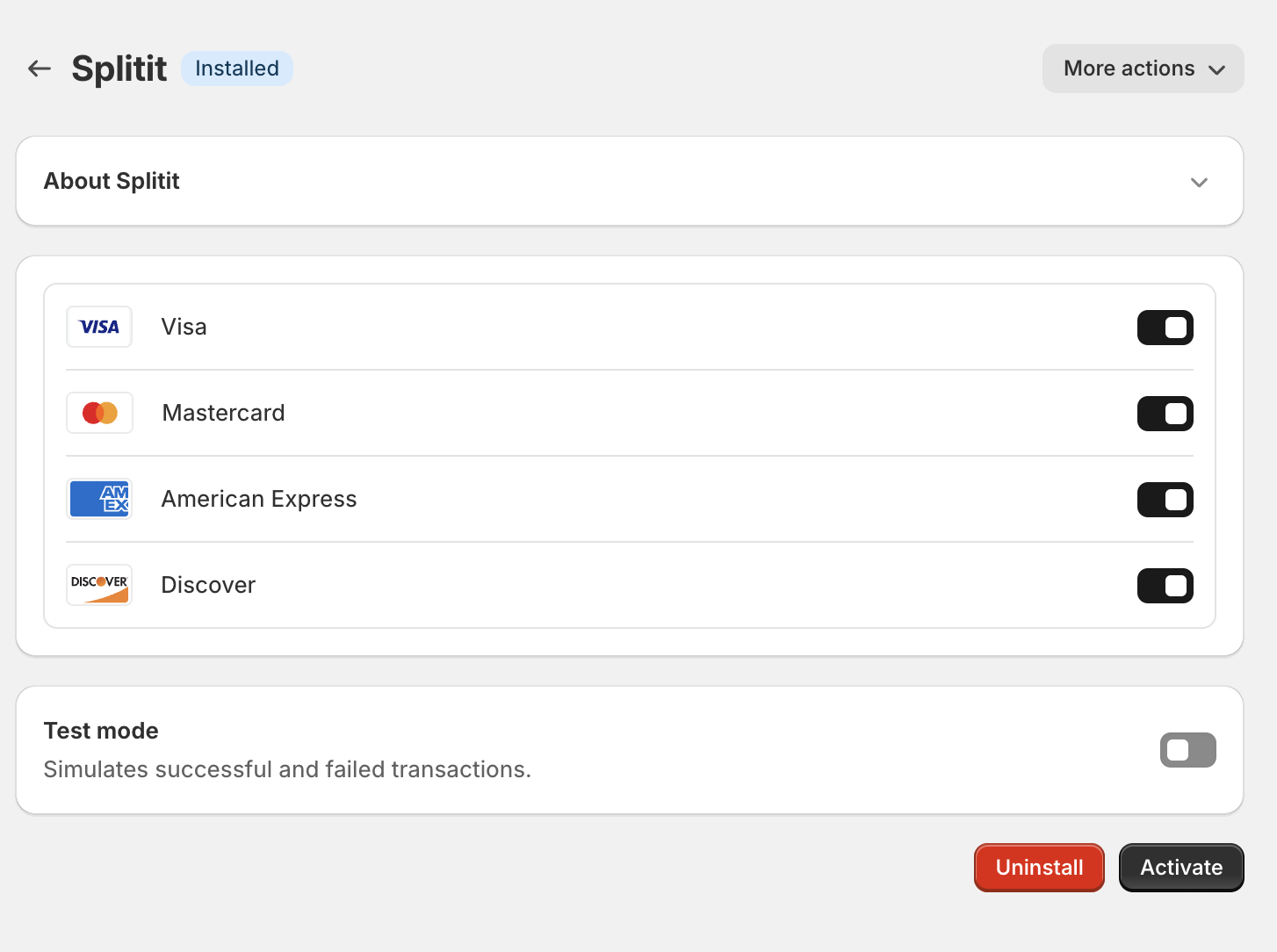
6. On the next screen, select the cards you would like to accept, leave Enable test mode unchecked, and then click Activate:
7. Splitit Checkout is now activated in your store.
8. Proceed to the On-Site Messaging Installation Guide to add On-Site Messaging.
Shopify Admin Order Management
Note that all order management for Splitit plans originating in Shopify should be done in Shopify, not in your Splitit Merchant Portal.
Refunds
Partial and Full Refunds
1. In your Shopify admin, go to Orders then click on the order you wish to refund.
2. Click Refund along the top right of the order (it will only appear if applicable).

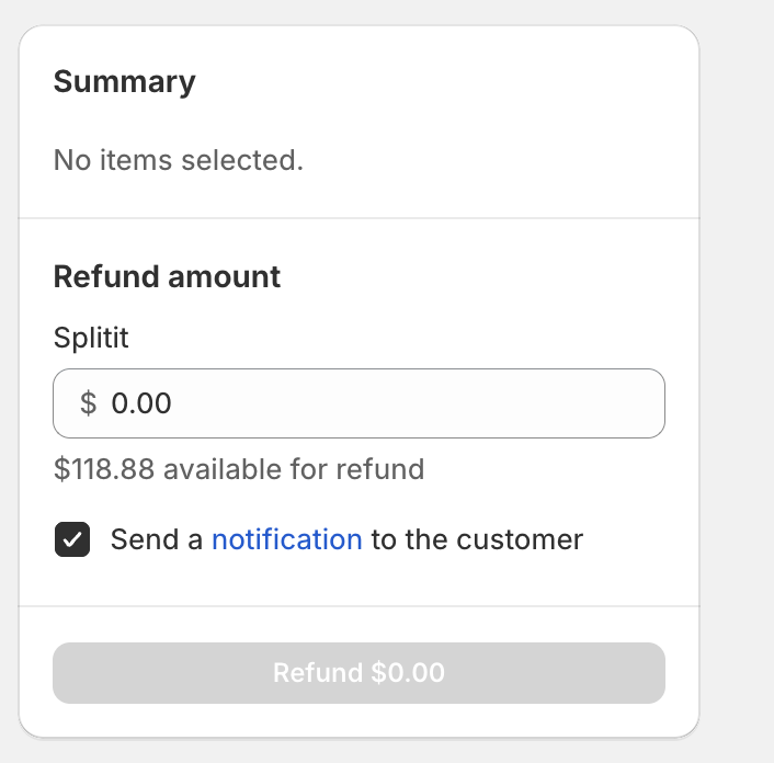
3. Under Refund Amount, enter the amount you’d like to refund:
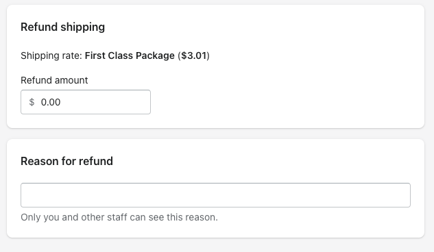
You can also decide whether to refund shipping or not and can add a reason for refunding:
Finally, click Refund to put the refund through.
4. You will see the amount refunded in your Splitit merchant admin and will see the status updated in your Shopify order list.
Note that refunds are applied using the default Splitit strategy, which is to subtract from a user's future obligations before returning funds to a user's card.
Canceling an Order
Orders that have been created without funds captured can be canceled.
1. In your Shopify store's admin, go to Orders then click on the order you wish to cancel.
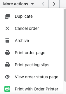
2. Click More actions along the top right, then Cancel order from the dropdown:
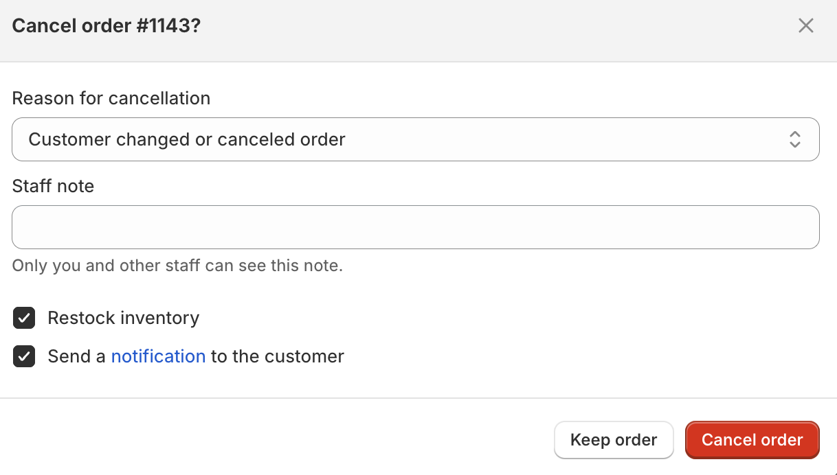
3. In the popup, select the reason for cancelation, enter an optional staff note, decide whether to restock inventory, and whether to send a notification to the customer, then click Cancel order:
4. In your Splitit merchant admin, you will be able to verify that the plan was successfully cancelled by looking at the list under Transactions, in the Status column:
